While Germany and Italy were nurturing a growing fascination with type, France was busy fighting the Hundred Years War, which lasted from 1337 to 1453. When the Hundred Years War reached its end, France’s artistic influence expanded under a desire to invigorate its national culture.
Before we explore the origins of French typography, let’s briefly recap what we’ve learned so far.
The Highlights
After the invention of the Western printing press and movable type in 1450, printing and type found their second home in Italy through the influence of German and German-trained type designers.
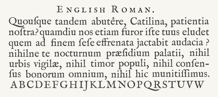
The first Italian press opened in 1465. It printed in an Antiqua typeface, which would eventually evolve into Roman. Roman type is simple and unembellished. It was created to separate type from handwriting, and it soon became the prevailing typeface across Europe.

Italy also introduced the world to Italic type. The original Italic, credited to a designer called Francesco Griffo, was basically a slanted Roman. It was the first time both upper and lowercase letters were used in the same typeface, and it also made books easier to read and more economical.
To France!
Enter King Francois I. King Francois reigned in France from 1515 to 1547. His tolerance for religion gave Protestant publishers a chance to operate freely without fear of prosecution, which resulted in an improvement in printing quality and boosted France to typographical excellence. King Francois was also the first king to appoint an official printer, which launched the tradition of a royal printing works.
Before we turn to the big players in French typography, let’s take a look at the typeface that started it all: French Gothic-Batarde.
French Gothic-Batarde
The first French trade press was established in 1470 in the Sorbonne, only a year after the first printing press arrived in Venice. Like in Venice, the printers who operated France’s first press were actually German, and they used Gothic typefaces until French printers and type designers were able to create their own.
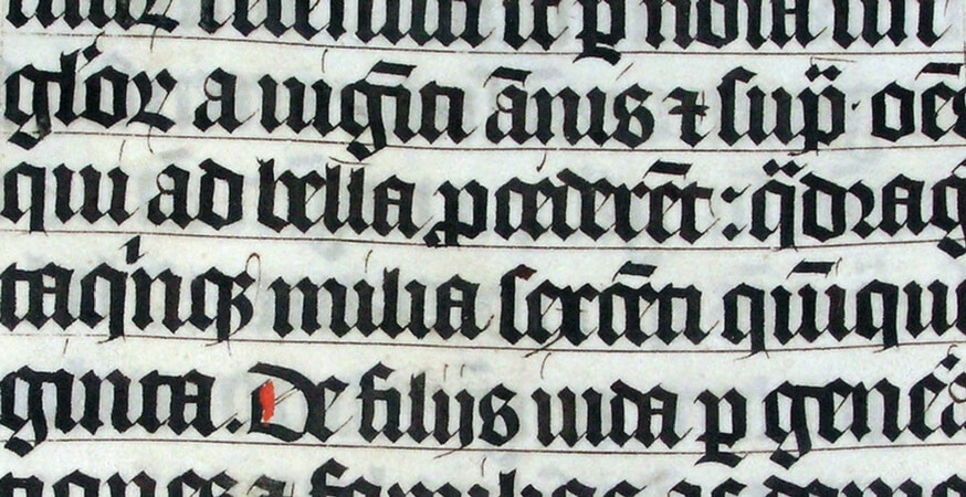
The first book printed in the French language, called Chroniques de France, was printed in 1477. It was printed in a typeface called French Batarde, which was characterized by its fine ornamentation. It still looks a bit Gothically-inspired, but it marks the beginning of a transition into a more refined typographical style.
Geofroy Tory
Earlier, we mentioned that King Francois I was the first French king to appoint a royal printer. Well, the first royal printer he appointed was named Geofroy Tory, and Tory’s first publication was an interesting one.
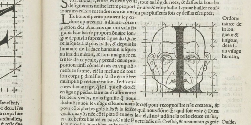
Tory’s first publication was actually a three-book set. The first book set out to establish the French language using fixed rules, the second book explained Tory’s theory that Roman-style capitals were derived from different parts of the body (yes, you read that right), and the third book gave exact designs for letters and how to execute them using thigns like perspective and mythology. We told you it was interesting.
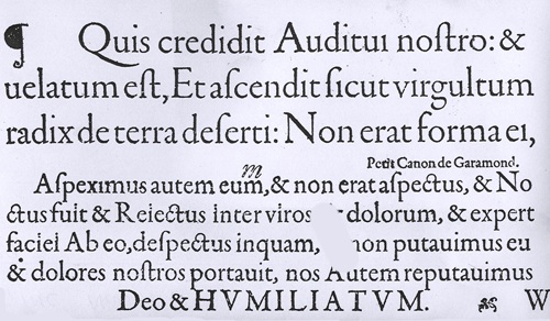
Garamont
Tory had a student named Garamont, a name you might recognize from one of the fonts you’ll find in your font library, Garamond. Funnily enough, the Garamond font you see in your word processor isn’t actually a true Garamont. This font was based on a typeface cut by someone else, but we’ll learn more about him later.
Garamont’s type styles moved away from ornamental calligraphy we see in French Gothic-Batarde and towards typographical refinement.
Garamont cut a typeface in 1520 that is arguably influenced by Griffo’s design for Manutius, but it was the typefaces Garamont cut between 1530 and 1545 that are considered the typographical highlight of the 16th century.
Jean Jannon
Remember how your word processor’s Garamond isn’t actually a true Garamont? That’s because it was actually cut by this guy – Jean Jannon. (For reference, Adobe Garamond is a true Garamont.)
Jannon started designing his own typeface in 1615 so he didn’t have to order type from Paris, Holland, or Germany. His new typeface was based on Garamont’s, but Jannon’s glyphs feature more angular serifs.
Jannon’s typeface actually went “missing” (read: was completely ignored) for about 200 years. When it was “discovered” in 1825, it was attributed to Garamont.
Next Stop
Part 1 – Humble Beginnings
Part 2 – Italian Inspiration
Part 4 – If It’s Not Baroque, Don’t Fix It!
Sources
“French Typographic Contributions”. Graphic Design History. 2011. http://www.designhistory.org/.