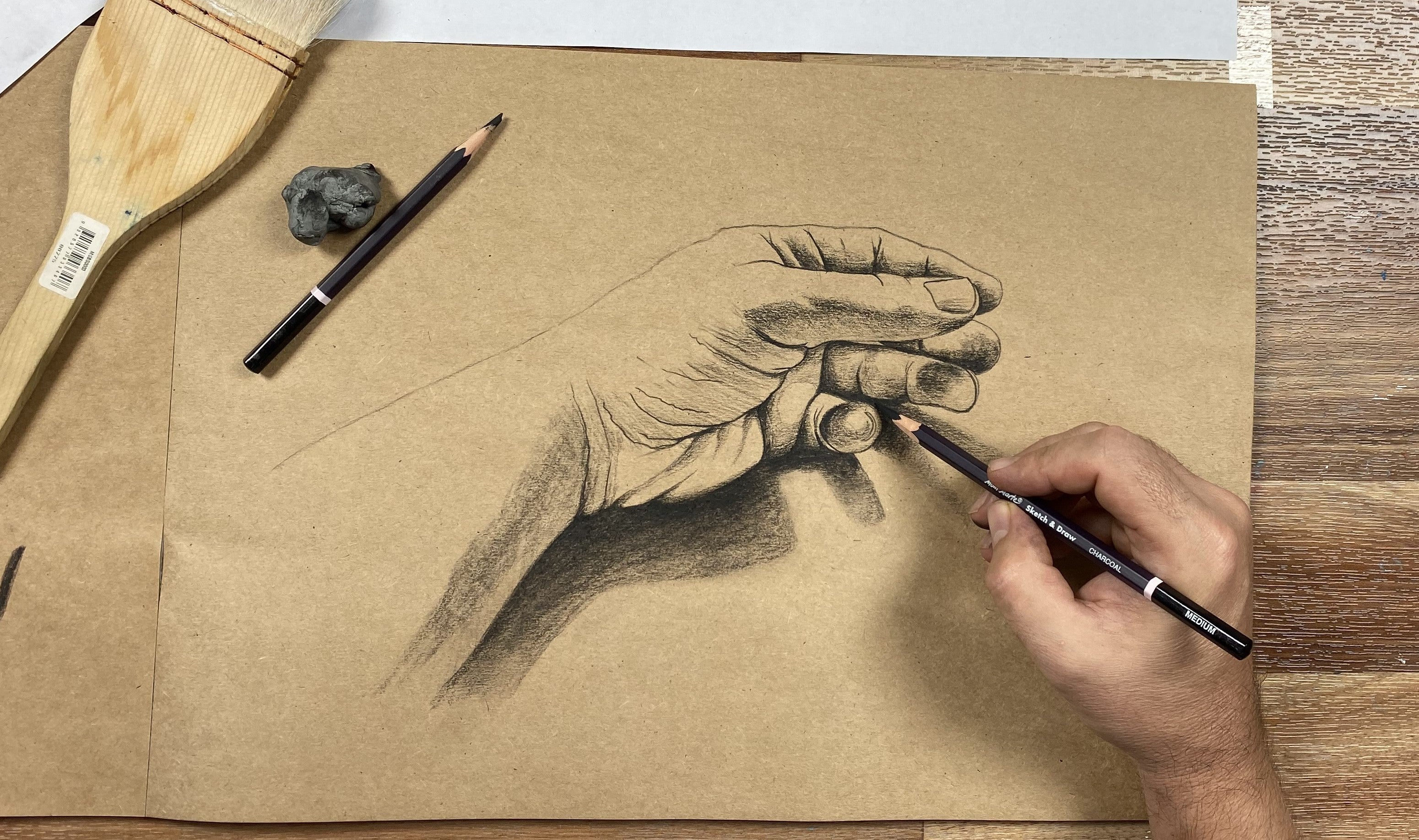


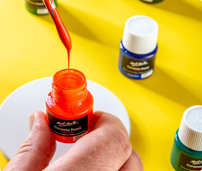


Level up your sketches by learning a few drawing texture techniques. We cover some basics to more advanced skills, so you can find the right fit for you. Being able to capture tactile feelings and depth in your artwork helps when you’re creating a realistic sketch, so follow along to discover more!
Easy textures to draw
To get you started on the road to texture, we’ve got some simple techniques you can try out for different effects.
Frottage – this is when you put a piece of paper over a textured surface and rub pencil, charcoal, or other dry media on it. The media will pass over the lumps and bumps of the texture, creating dimension and replicating the feeling of the surface beneath the paper. This works great for tree bark, rocky surfaces, and grainy textures.
Stippling – a simple technique where you use your media to apply small dots to your paper. The dots will blend at a distance to create a bigger picture, shading, or details. The closer your dots are to each other, the darker the effect, while sparse dots have a lighter impression. You’ll find this technique in styles like Pointillism, often creating a more gentle and smooth shading technique across the artwork.
Broken cross-hatching – this is great for creating that classic hatched metal texture, like for garage flooring or some toolboxes. It can be used for any texture you want to appear rougher and less polished, depending on your subject matter and art style. It’s basically the same as cross-hatching but the lines don’t overlap. Instead of blended shading, draw a set of small parallel lines, and then add more lines at perpendicular angles from the first set, never overlapping them.
Leaf drawing
Start your leaf by drawing the larger veins first. Veins branch out from the centre vein, creating a webbed effect that replicates the natural patterns found in leaves. Remember, nature isn't perfect, so keep your lines a little crooked and organic rather than perfectly straight.
Connect the smaller veins to the larger ones with fine lines, creating a patchwork or cell-like pattern across the leaf surface. As you work, continue to branch and scale down the veins to add more detail. The final result should almost look like shattered or stained glass.
Once you've mapped out your veins, bolden the outlines of the larger ones to give your leaf definition and depth.
Ground drawing
Begin by outlining the cracks in the stone, using wobbly and organic lines that reflect the craggy surface of the earth. Leave negative space within the cracks for now – you’ll define them with shading in the next step.
Once your cracks are outlined, shade them darkly to give the stone a weathered appearance. Smudge the shading on the side of the cracks that would be in shadow to add depth and realism.
Next, add finer cracks branching off from the larger ones, similar to the veins in a leaf. Keep the larger cracks darker and the smaller ones lighter to enhance the sense of depth and texture.
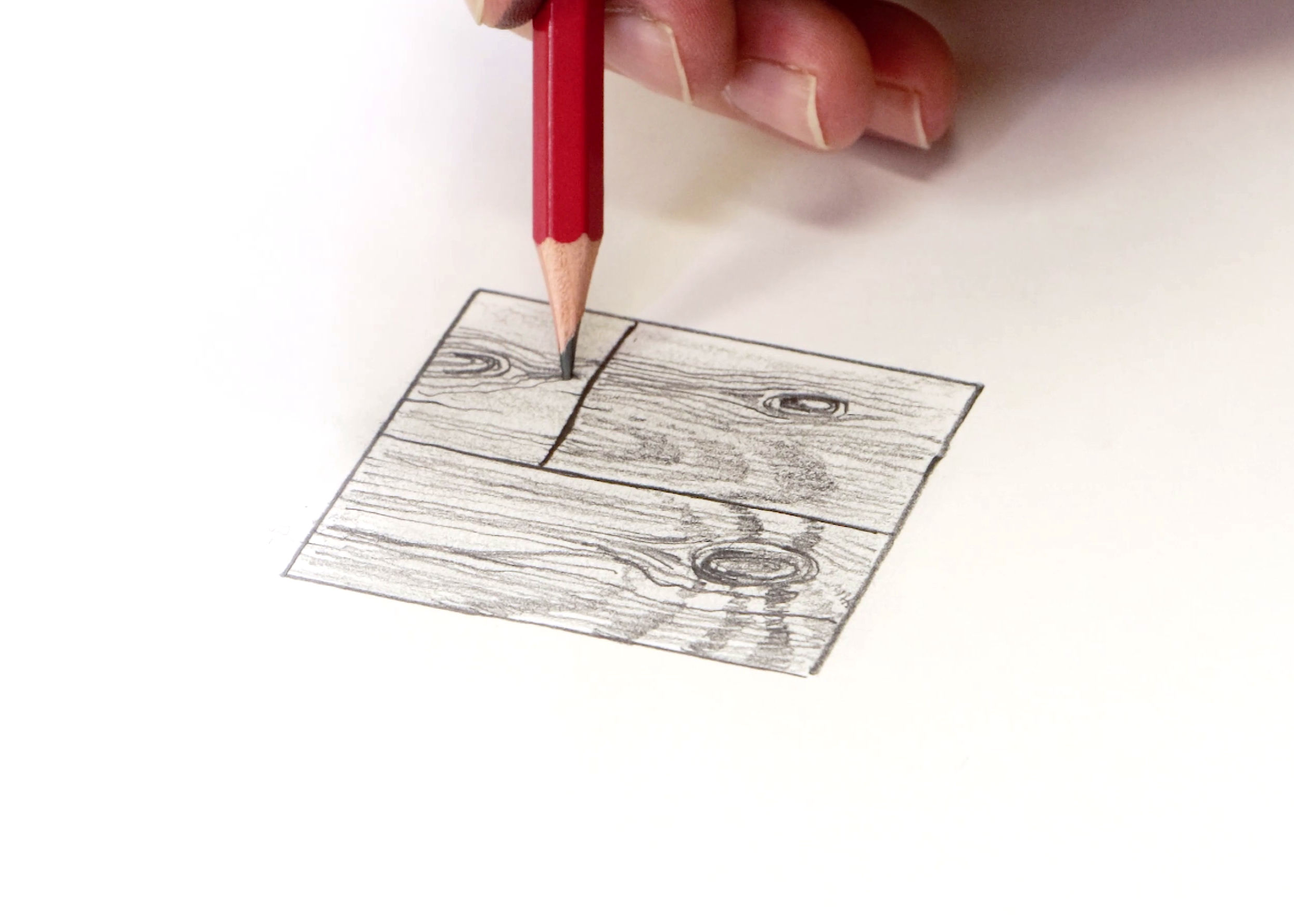
Wood drawing
Wood planks typically feature grain lines and cracks, creating a rustic appearance. Begin by mapping out these outlines, including the cracks, grain lines, and shadows.
Bolden the details and shade one side of the crevices to create depth and dimension. This implies a light source and improves realism. Don't forget to include knots and rounded crevices that follow the grain of the wood.
Keep your shading and details consistent with the direction of the grain, warping slightly around knots and imperfections. Bolden the details to ensure that the ripples and knots become a similar tone, leaving plenty of negative space for highlights to pop.
Waterdrop drawing
Start by lightly shading your background with a cotton tip to create a smooth base for your waterdrops. Then, pencil in your raindrop shapes with fine lines, deepening the tone in areas of shadow.
Outline the highlights of your waterdrops and add shading around them to create a three-dimensional appearance. Remember that water is smooth, so using a cotton tip for blending will help recreate that look and feel.
Repeat the process for each raindrop, ensuring that the highlights stay bright. If needed, add highlights back in using an electric eraser. Finally, blend out the edges of any cast shadows, keeping the overall picture soft and smooth.
Fur texture drawing
An important tip to keep in mind when tackling fur texture is that not all fur strands move in the same direction. Make sure you’re not just colouring back and forward in straight lines, as the strands are more curved and organic in real life.
Start by looking at your reference picture and identify the different clumps of fur, paying attention to their flow and movement. Work lightly and map out the darker areas, leaving negative space where there are highlights and lighter tones. Draw your strands fluidly, not using straight lines and keeping in mind the how the different sections flow together.
Blend your base layer and soften the edges so you have a foundation to add details on top of. Keep your pencil nice and sharp and add individual strands over the shadow areas using a darker pencil grade. Work lightly, building up the strokes and making the direction of your fur clear using curved lines.
Progressively layer more strands with darker pencil grades to the deepest areas of the fur, lifting shading from the highlighted areas as needed with an eraser.
Drawing bricks
Begin by mapping out the stonework, starting with horizontal guidelines to outline the pavers and leaving negative space for the grout. Add vertical lines to define the individual stones.
Boldly outline the stone shapes, erasing your working lines as you go to create clean shapes. Shade the pavers in a consistent direction to add texture and dimension, using a cotton tip to soften the pencil lines.
Scribble in texture details such as imperfections and crevices to build up the realism of the masonry. Deepen the bottom edge of each paver to add depth and volume, and lightly dot and shade the grout to increase texture.
Hair texture drawing
Drawing hair is pretty similar to drawing fur, but with longer strands and sweeping movement. It’s important to keep in mind that hair highlights are always on rounded or protruding sections, as they break away from the main hair body and reflect more light. This is typically seen as a highlight band across the curved area, where the light bounces off the surface.
When looking at your reference, map out overall shape of the hair, before lightly drawing in the darker areas, curves, and highlights. Where the hair curves, take note of the direction the strands follow, and how they reconnect with the main body of hair. Keep negative space at the centre of the curves for your highlights and deepen the straighter sections.
Blend out the shading to create a smooth base before adding back in detailed individual strands, being careful to keep your highlights exposed and bright.
Have a go at some of these techniques and try drawing different textures at home. When it comes to realism and capturing depth, it’s a matter of practice. Start small and keep going!
We hope that you feel inspired by these texture drawing examples and get creating. #montmarteart or tag us @montmarteart on Instagram or Facebook if you sketch something; we’d love to see what you come up with!
Looking for more? Check out our tips and techniques page for more inspiration. If you need supplies or want to experiment with one of the techniques mentioned, jump online to check out our sketching sets and paper.