
I Tried This Controversial Color Rule in My Living Room, and I Wish I’d Done it Sooner
When I was growing up, my dad called most of the decorating shots in our house; he has an eye for art, antiques, rugs, and more. I’d always admired his design style, but it wasn’t necessarily my style. Where I loved pastels and modern touches, he preferred classic pieces and primary colors.
As I’ve gotten older, I’ve (smugly) realized it’s true that parents really do know best. Case in point: When I first moved into my current apartment in 2020, I went all in on the then-trendy Danish pastel aesthetic. The decor style slowly started to fade out, though, so I prioritized curating a more timeless look. I channeled inspiration from my dad’s design playbook, including a favorite color of his that I’ve always shied away from: red.
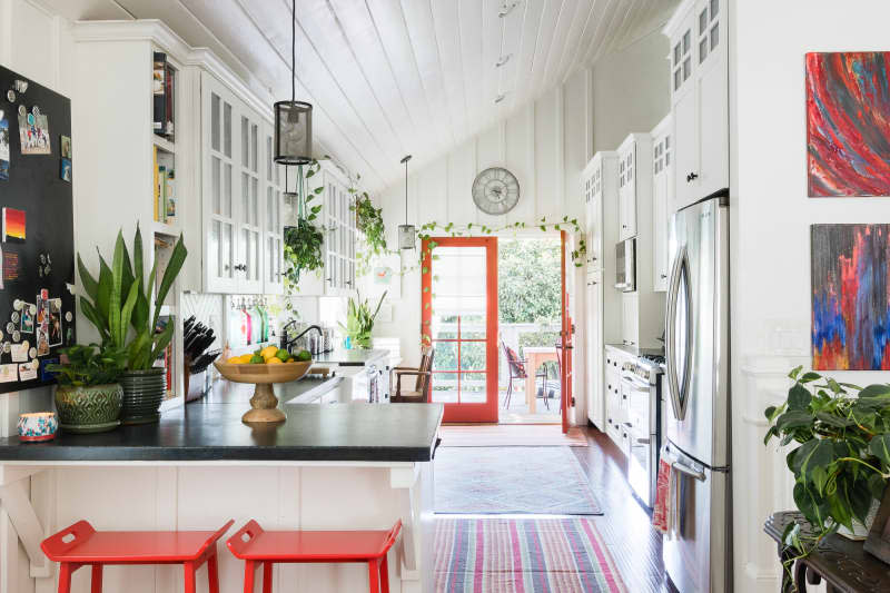
I’ll admit that my dad was definitely on to something before this semi-controversial shade became “cool,” but now that red has started dominating runways and homes, I’m officially hooked. I even discovered the viral “unexpected red theory” on TikTok, which the original creator Taylor Simon (@intayriors) described as “adding anything that’s red, big or small, to a room where it doesn’t match at all — and it automatically looks better.”
The TikTok video shows a handful of unexpected red theory examples, but one specific Pinterest find doubled as my new mood board: An airy, modern dining room space punctuated with a few red woven chairs. I had to hunt down this exact same seating style and try out the red concept for myself, until I discovered the ones from the photo are vintage 1960s Italian models that retail for about $1,200 on 1stDibs. Luckily, after some Facebook Marketplace digging and a road trip to Connecticut, my boyfriend helped me bring home a dupe for just a few hundred dollars.
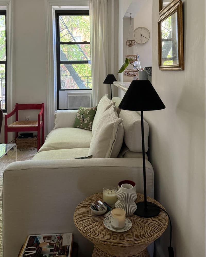
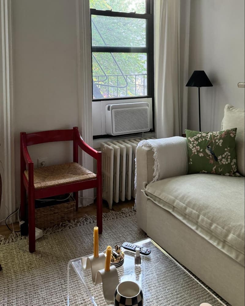
Originally, I planned to style the chair in a small alcove in my bedroom, but its modest sizing felt disproportionate next to my dresser. I did some rearranging in my living room, situating it in between two windows next to my couch, and the bold hue instantly made the space feel more elevated and dimensional. It also concealed the basket storing my internet router — win-win!
My whole apartment admittedly is in dire need of more color, but the living room especially lacks natural light, which is why I’ve gravitated toward predominantly white and ivory tones to help brighten things up. I’d been looking for some sort of statement item, though, and I’m so glad that TikTok steered me toward a red palette. The chair nicely disrupts my light-hued sofa, rug, and curtains, while doubling as a fresh — and, dare I say, unexpected — focal point that stands out without dominating the room.
It’s also given me new decorating momentum in an otherwise unused spot. I still need to fill out the blank wall space directly above the chair, especially to add height and draw the eye upward, but I now have the perfect jumping-off piece that can play up a range of different decor hues (although I’m envisioning a trio of decorative, blue-toned ceramic plates). Simon even adds in the TikTok above that she’s “petitioning for red to be a neutral color because it just looks good with everything.”
If you also have a majority neutral home or just want to experiment with a color outside your comfort zone, the “unexpected red theory” can be pulled off with any accent, from a table lamp to a picture frame. I’m happy I committed to a more large-scale furniture style, though, that maximizes more seating in a small room. Consider pieces like red nightstands or storage cabinets (IKEA has some cute options, FYI) to double down on aesthetics and functionality, too.
You can find different red tones to complement your space, as well, like a more subdued burgundy or brick red. The concept does hinge on “unexpected” iterations that may seemingly conflict with your existing design setup, so don’t be afraid to get creative. Either way, as my parents’ (tasteful!) red dining room of 20+ years proves, this color is timeless — even if trend cycles might eventually say otherwise.

