What is Tailwind CSS?

Introduction to Tailwind CSS
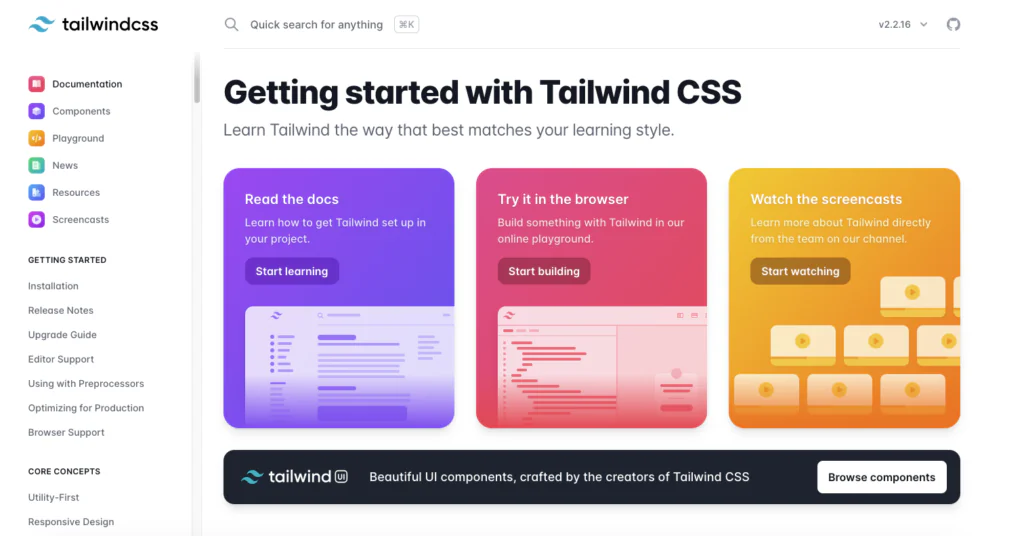
Tailwind CSS – I think it would be hard to find a developer who has never heard of it. It’s one of the most popular CSS frameworks right now, used by OpenAI, Shopify or Loom. It’s utility-based, making dev’s work easier and enabling rapid UI development.
Today I will discuss what exactly it is, what are its main benefits and how to configure it. And believe me, once you try it, you won’t want to use anything else.
What is Tailwind CSS?
Tailwind CSS is a utility-first CSS framework. What does utility-first mean? Well, it means that you can use predefined utility classes to build your components and layouts and you can use them however you want. You just have to know some basic CSS rules, to make the elements look like you want them to look. So it’s a very flexible approach.
A lot of developers like to use Tailwind CSS because it’s easy to learn and once you get it, using it will speed up your work a big time. You won’t have to spend more time thinking about new class names, you just use the existing ones and focus on more important things.
Why Use Tailwind CSS?
- Ease of Learning and Rich Documentation
- Utility Classes Over Custom Classes
- No More Overthinking Class Names
- Quick Project Kickoff
- Simplified Code Reviews
Ease of Learning and Rich Documentation
If you are new to the project and Tailwind is used there it should be easy for you to catch up and you should be able to create your first PR with CSS changes pretty fast. Documentation is great, you can find almost everything there. You can also find some cheat sheets on the web, but the documentation itself is also very readable and developer-friendly.

Utility Classes Over Custom Classes
Utility classes mean you don’t need to invent your own; you can assemble layouts and components from what is available. It’s well-paired with libraries like clsx to make modifying components easier.
No More Overthinking Class Names
It saves time – you don’t have to think of new class names. Everything is added and modified within the element, so you won’t break other elements while changing styles in some other place.
Streamlined CSS Management
You don’t have to create separate files to add CSS to each component (unless you want to, which is not forbidden 🙂), and you can see all of the applied styles while looking at the HTML. Tailwind CSS works by scanning all of your HTML files, JavaScript components, and any other templates for class names, generating the corresponding styles, and then writing them to a static CSS file. This makes the size of the app smaller because you’re not loading any unnecessary styles.
Quick Project Kickoff
It’s quicker to kick off the project because the base is already there, and multiple people can start working on the styles earlier; only the tailwind config has to be configured. You don’t have to use methodologies like BEM to make the code consistent.
Simplified Code Reviews
While doing a Code Review, you don’t have to jump between the files to check if the styles are okay for the given HTML structure; you can see everything in one place.
Tailwind CSS vs Bootstrap (component-based frameworks)
Frameworks like Bootstrap, component-based, provide a series of predefined classes that you can use to style for example a button. It’s easy to use, but in case you want to modify the appearance of some components, it may be a bit harder to overwrite some styles than to change some utility classes.
Is Tailwind Better Than Bootstrap?
Tailwind CSS is often preferred for projects that require heavy customization, unique branding, and a focus on performance. It shines in complex, modern web applications where granular control over styling is essential. Bootstrap is a good choice to write css for rapid prototyping, building MVPs, or projects with less emphasis on custom design. It is also suitable for larger teams where consistency and standardization are key.
Tailwind CSS vs Traditional CSS Comparison
Compared to traditional CSS methods where styles are added globally and can cause issues when modified elsewhere, Tailwind ensures that unused classes are not added to the app. You can also use it in conjunction with traditional CSS if needed.
Is Tailwind CSS Better Than Regular CSS?
Tailwind CSS is often preferred for projects that require heavy customization, unique branding, and a focus on performance. It shines in complex, modern web applications where granular control over styling is essential
Regular CSS is a good choice for projects with simpler styling requirements, where the overhead of learning and using a CSS framework is not justified. It is also suitable for projects where complete control over styles is crucial, or when working with legacy codebases that may not be compatible with CSS framework.
Configuring Tailwind CSS
Initial Setup
The first thing you have to do when adding this framework to your project is to update the `tailwind.config.js` file to match some values from the project’s design, like colours, spacings, and typography. You can overwrite the existing values completely, or just extend them. Each object can be modified separately – you can for example replace all of the colors, but leave the predefined spacings and extend them with one more.
// tailwind.config.js
module.exports = {
  theme: {
    extend: {
      colors: {
        'custom-blue': '#007bff',
        'custom-green': '#28a745',
      },
      spacing: {
        '72': '18rem',
        '84': '21rem',
        '96': '24rem',
      },
      fontFamily: {
        sans: ['Graphik', 'sans-serif'],
        serif: ['Merriweather', 'serif'],
      },
    },
  },
}
- We added
custom-blueandcustom-greento the color palette. - We introduced three new spacing values: 72, 84, and 96.
- We specified custom fonts for
sansandserif.
Responsive Layouts Made Easy
It’s easy to create responsive layouts. Tailwind uses a mobile-first breakpoint system and it comes with five predefined breakpoints that you can use. You can modify them or add new ones if you need. All of the changes will be visible in one line of code instead of a separate media query rule.
There are five default Tailwind CSS Breakpoints:
| Breakpoint prefix | Minimum width | CSS |
| sm | 640px | @media (min-width: 640px) { … } |
| md | 768px | @media (min-width: 768px) { … } |
| lg | 1024px | @media (min-width: 1024px) { … } |
| xl | 1280px | @media (min-width: 1280px) { … } |
| 2xl | 1536px | @media (min-width: 1536px) { … } |
// tailwind.config.js
module.exports = {
  theme: {
    screens: {
      'sm': '640px',
      'md': '768px',
      'lg': '1024px',
      'xl': '1280px',
      '2xl': '1536px',
      '3xl': '1920px', // Added a new breakpoint
    },
  },
}
In the example above, we keep the default breakpoints and add a 3xl breakpoint for larger screens.
Dark Mode Support
Out of the box, we can also set different styles when we are in light or dark mode.
Automatic Dark Mode
By default, Tailwind uses the prefers-color-scheme media feature. This means it automatically applies dark mode styles if the user’s system preference is set to dark mode.
// tailwind.config.js
module.exports = {
  darkMode: 'media',  // Automatic dark mode
};
/* Light mode styles */
body {
background-color: #fff;
color: #000;
}
/* Dark mode styles applied automatically based on system settings */
@media (prefers-color-scheme: dark) {
body {
background-color: #333;
color: #fff;
}
}Manual Dark Mode Toggling
If needed, you can also let users toggle dark mode manually using a selector-strategy. This involves adding or removing a dark class on the <body> to change styles.
Using CSS Variables with Tailwind
If you’re a fan of using CSS variables, you can use them here as well. You can declare them in `@layer base` (or somewhere else, it can be component-scoped), and then use them in the config file or use a square bracket notation to generate a class on the fly with any arbitrary value.
Conclusion
Tailwind is a very popular framework these days. You can find a lot of information about how to use it and modify it on the web. It’s used in more and more projects and makes devs’ lives easier. Writing code takes less time, code review is also pretty fast thanks to this and it’s pretty easy to learn for someone new. It can be tailored to the project’s needs easily and not used utility classes are not included in CSS, making the page lighter and faster.
Looking for experienced fronted developers?
Read more
Best React JS Tech Stack in 2024
Best React Native Tech Stack in 2024
UX and UI in mobile app development
Sources:


