
The best romance film posters of all time

- Oops!Something went wrong.Please try again later.
- Oops!Something went wrong.Please try again later.
Romance may get dismissed by some as a lightweight genre, but it has the power to truly captivate audiences with enchanting tales of love, passion and heartache. And the best romance film posters play a crucial role in this process, by setting the tone, building anticipation and capturing the essence of the story.
To curate this list, we've invited a panel of experts to help us select the best film posters from the romance genre, and provide keen insight into why they work so well. Like the best horror film posters, these brilliant designs not only promote the films but also serve as works of art in their own right. In no particular order, here are what our experts think are the best romance film posters of all time...
01. The Notebook (2004)

Ask people to name a romantic film, and there's a good chance they'll answer 'The Notebook'. Directed by Nick Cassavetes, this adaptation of a Nicholas Sparks novel featured a non-linear storytelling structure, switching back and forth between a 1940s love story and modern-day nursing home scenes. And its epic, classic sense of romantic drama and sweeping visuals, combined with the intense on-screen chemistry of Rachel McAdams and Ryan Gosling, made it a huge hit with audiences worldwide.
Even if you haven't heard of the film, though, you'll get an instant sense of what's on offer from this arresting poster. Featuring the young stars in an intimate close-up, against a blue-tinted rainy background, its misty aesthetic is a perfect match for this melodramatic love story.
"Rain adds visual drama to the iconic scene, and the wet clothes are clingy and translucent," points out Sammi Price, creative lead at Trinity Create. "That hints at sensuality without nudity; useful under strict censorship. Ultimately, rainy kisses symbolise uncontrollable passion, transporting audiences into a realm of romantic fantasy. This imagery evokes nostalgia and captures the essence of Sparks' romantic storytelling."
The layout, meanwhile, gives the image full room to breathe and do its work. "The design is relatively simple, clear and focused, relying on sheer emotion to take centre stage," explains Alice Lang, senior digital PR executive at Marketing Signals. "You can almost feel Rachel McAdams and Ryan Gosling's real-life chemistry by looking at it; a testament to how successful the film became."
02. Pretty Woman (1990)

Pretty Woman is a retelling of the classic Cinderella fairy tale, but with a modern twist. The film follows a sex worker (Julia Roberts) living in Los Angeles who's hired by a rich businessman (Richard Gere) to be his escort for a week. Initially, their relationship is purely transactional. But as they spend more time together, an unlikely connection forms between the two.
Why was the film so popular? Quite simply, it's just a brilliant, wish-fulfillment drama, crackling with life and energy, packed with wit and pathos, and utterly compelling from start to finish. And if you're in the market for a feelgood ending, you've come to the right place.
Surprisingly, the poster doesn't look at all dated, even 34 years on from the film's release. As Greg Berry, head of design at True, puts it: "It transcends its early 90s origins, remaining a testament to the power of simple elegance. It's a minimalist masterpiece, utilising bold colour choices and negative space to create a visually stunning and emotionally charged image."
The use of silhouette, in particular, is a masterstroke. "We see the elegant curves of Vivian's outfit and the broad outline of Edward's tuxedo, hinting at their physicality without revealing too much. This allows viewers to project their own interpretations onto the characters, adding a layer of intrigue and universality."
And the poster isn't just about aesthetics; it cleverly hints at the film's core theme: a clash of social worlds. "The bright pink stands out against the white background, just as Vivian, a woman from a different background, stands out against the polished world of Edward," Greg explains. "So once you've seen the film, the poster becomes even richer. The starkness of the initial design gives way to a warmer feeling as the characters connect."
03. Titanic (1997)

No film has ever combined the romantic genre with the disaster movie quite as powerfully as 1997's Titanic. Directed by James Cameron, this hugely expensive, three hour-plus epic masterfully weaves together the heart-wrenching romance between Jack and Rose with the harrowing and tragic events of the real-life ship's sinking in 1912. No wonder it shattered box office records and dominated the Oscars in a way that few films have achieved before or since.
Its iconic poster, meanwhile, somehow manages to capture all the epic scale, romance and tragedy of the film in a single design. As Karim Salama, director at e-innovate, puts it: "It exudes a sweeping sense of grandeur and passion, perfectly encapsulating the tragic irony of an epic love story set against the backdrop of a tragic historical event."
The poster features a striking side profile of the two lead actors (Leonardo DiCaprio as Jack and Kate Winslet as Rose) embracing in an intimate pose against the backdrop of the massive ocean liner. "The size of the ship, looming behind the lovers, symbolises the grand, larger-than-life production and scope of the movie," notes Karim. "The tagline, 'Nothing on Earth Could Come Between Them' hints at the unstoppable force of Jack and Rose's love. And this is also reflected in the warm amber hues highlighting the couple, contrasting with the forbidding tones of the boat and stormy sea below."
04. Breakfast at Tiffany's (1961)
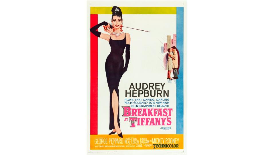
Released in 1961, Breakfast at Tiffany's follows a charming New York socialite, Holly Golightly (Audrey Hepburn) and her neighbour Paul (George Peppard) as they help each other navigate their chaotic lives together. On the face of it, it's just a fun, screwball comedy. But under the surface there's quite a lot of serious stuff going on about loneliness and societal expectations.
More broadly, Breakfast at Tiffany's has had an enduring influence on fashion, cinema and popular culture. In particular, its iconic poster has adorned the walls of generations of people.
"It's a timeless slice of glamour," explains Sammi. "Audrey Hepburn, with that iconic Givenchy dress and pearls, is elegance personified. The colour palette is as chic as Audrey herself, with subtle hues that scream sophistication. Overall, it brilliantly captures the essence of the film's style and the lead actress's charisma. It has a visual identity that whispers, 'Timeless beauty and a dash of Audrey magic await.'"
05. Love in the Afternoon (1957)

Another Audrey Hepburn classic, Love in the Afternoon is mainly on our list because its poster was designed by Saul Bass. But it's a pretty great movie nonetheless. This romantic comedy film, set in Paris, follows the story of a young woman who falls for an older businessman. Overall it delicately balances wit, humor and poignancy, while exploring an unconventional romantic dynamic.
Ultimately, though, its poster is remembered for being one of a line of Saul Bass classics. As Claire Bradley, creative director at IMA, explains: "Bass reinvented what graphic design in film could be in the '50s, smashing through the conformity of the grandiose 'classic Hollywood' movie posters." Today he's best known for his designs for suspense thrillers such as Anatomy of a Murder and Vertigo. "But the fact that it could work just as well in the romance genre is a testament to his visual storytelling prowess. This one is beautifully atmospheric, evocative, visceral, and immediacy of narrative – all through a less-is-more approach. Perfection."
Bass was the first major designer to abandon the tradition of featuring the stars on the movie poster. And as Jay Phillips, creative director at BBH London, notes, they’re nowhere to be seen here. "Neither are any of the much-referenced scenes from the movie." And therein lies the poster's strength and originality.
"Instead, we get the restraint, the tease, the innuendo, the fun. It encapsulates everything that an afternoon watching this movie has to offer. In short, this poster doesn’t rely on the famous stars to get bums on seats, but wonderful design and storytelling. Saul once said, 'I want to make beautiful things, even if nobody cares'. Turns out a lot of people care."
06. Eternal Sunshine of the Spotless Mind (2004)

Directed by Michel Gondry, Eternal Sunshine of the Spotless Mind follows a couple (Jim Carrey and Kate Winslet) who are breaking up and so undergo a procedure to have their memories wiped. Yes, it's that weird.
If you haven't watched it yet, we'd heartily recommend you do so. It's one of those films that really makes you think; both while watching it and then for days on end after. At which point, you'll understand its iconic poster all the more...
"This is one of those posters that only reveals its contextual nuances once you've left the theatre," says Andrew Poole, head of film and motion at Atomic London. "It appears out of the fog of ambiguity; pointing a finger at you like one of those smug bakers who's just revealed that your mum is in fact made out of cake.
On second inspection, he explains, the crack in the frozen lake that supports Carrey and Winslet can be likened to the fragile nature of Carrey's recollections after going through this rash procedure. "This scene is positioned above a cropped portion of Carrey's head. His eyes are locked onto the figures of his past and of a couple still exploring the adventures and eccentricities of fledgling love.
"His eyes grasp at the isolated moment, betraying his futile longing to retain the memory, his desperation further amplified by the creeping gradient in the lower right corner that threatens to wipe his mind away, leaving a clear night sky and only the void."
Joanne Pawlett, director at Tailor-Made Signs & Embroidery, is also a fan. "This poster beautifully mirrors the film's unique and introspective take on love," she says. "The striking use of colour and imagery masterfully conveys the movie's central themes of memory and human connection in a visually appealing way. It skilfully blends earnest sentimentality with a contemporary edge, highlighting the ethereal essence of the film's love story, which takes place in a vibrant, musical world."
07. The Graduate (1967)
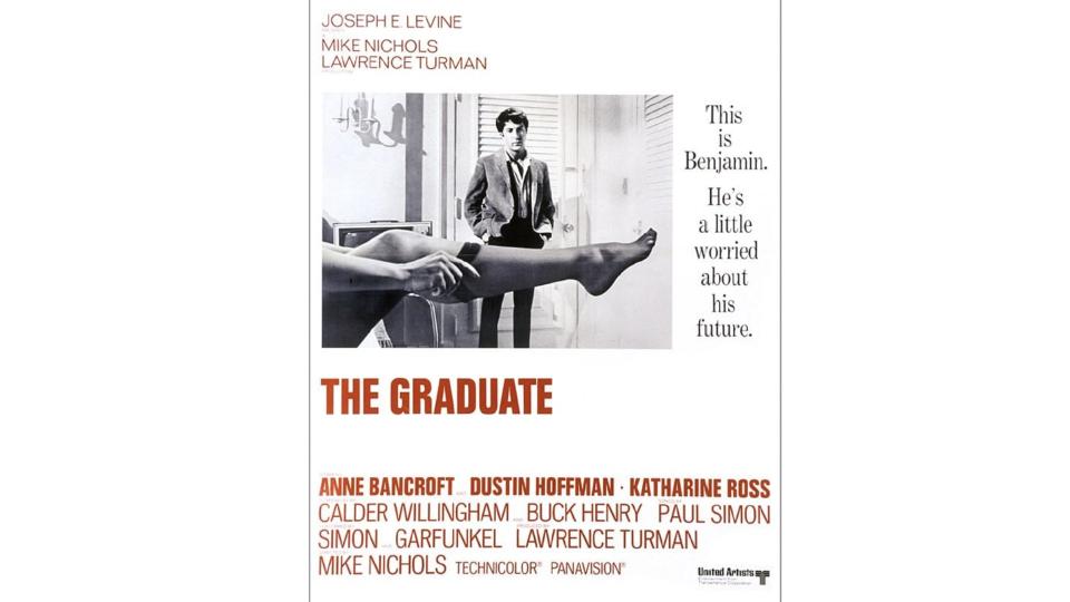
The beauty of romance is that it can blend into all kinds of genres. But few have stretched expectations as far as The Graduate, which took the theme of 1960s counterculture and melded it with a cross-generational, coming-of-age story.
The offbeat concept works thanks to Dustin Hoffman's unforgettable performance as Benjamin, a recent graduate who's adrift and unsure of his future. While his parents urge him towards a conventional path, he becomes embroiled in an affair with an older woman, played by Anne Bancroft.
Somehow, the poster manages to evoke all the nuances of the movie in one single design. "On the face of it, things look fairly simple," says Stephen Haggarty, executive partner, creative at Yonder. "It’s a story about a recent graduate who has some difficult choices to make about his future. But there’s something in the way the story on the right is written. Is it sarcastically alluding to things that are not what they seem? Look at the colours. Black, white: simple and straightforward. But then red, the colour of lust, for the collegiate slab serif font. Is this the first sign of the transition to adulthood?"
08. The Handmaiden (2016)

A romantic thriller directed by Park Chan-wook, The Handmaiden is based on the novel Fingersmith by Welsh writer Sarah Waters. Set in Japanese-occupied Korea in the 1930s, it follows a conman who hires a young pickpocket to become a handmaiden to a wealthy heiress, with the ultimate goal of seducing her and swindling her inheritance. However, the plan takes an unexpected turn when the two women develop an intensely sexual relationship.
A bold and explicit exploration of female sexuality and desire, the film was a milestone in Asian cinema, challenging gender norms and power dynamics, with erotic scenes that were unapologetically graphic. More broadly, its exploration of themes such as class, wealth, power and exploitation resonated with audiences and critics alike; it currently has a 96% rating on Rotten Tomatoes.
And what a poster. "Instead of relying on portraits of the cast," says Deanna Bains, senior designer and illustrator at Iris, "it engages viewers with a stunning illustration that contains thematic symbolism, and uses the design to give a glimpse into the narrative of the film, while maintaining a deep sense of intrigue.
"For people who haven’t watched the movie, we see characters and set pieces in a tapestry reminiscent of traditional Korean paintings from the era portrayed in the film, all anchored using this large tree. Then after seeing it, you understand the importance and weight of each detail, and the narrative the poster has told.
"There’s a direct translation of the film all through one graphic, and it’s done in such an elegant way, down to embedded type that makes this visual timeless. It’s a beautiful example of less-is-more, and making use of intricacies you can leverage from illustration that give it a massive standout in this category."
09. The Shape of Water (2017)

'Girl dates fish' doesn't sound like a mainstream cinematic hit. But with direction from Guillermo del Toro, many were willing to give it a go. And they were rewarded with a visually stunning, emotionally rich and unconventional love story that blends elements of romance, horror and fairy tale.
The film is set in the early 1960s during the Cold War era and follows the life of a mute janitor working at a secret government facility. When she discovers a mysterious amphibian creature being held captive in its laboratory, she develops an unlikely connection with it, and a tender, intimate bond forms between them.
Ell Jeffrey, senior designer at Waste Creative, speaks for many when he says: "I wasn't sure what to think going into The Shape of Water. But I knew that I needed to see it the moment I saw the poster. Two figures embracing beneath an endless ocean, the neutraface golden art deco typography framed by scales. Deep blues and greens we normally associate more with the likes of Jaws or The Shallows than we would with a love story somehow feeling warm, inviting, and tender. These hues permeate the film itself; every frame is beautifully considered in tone and grading. "
In seeing the poster again later, he realised the 'scales' framing the poster were in fact the art deco-printed wallpaper of Elisa's apartment. "A small detail adds weight in showing that, in being together, they are in fact home. A relationship between a mute custodian and a fish creature against the backdrop of 1962 Baltimore isn't the easiest sell for most people. But both poster and film succeed in telling the story of a beautiful, if unconventional, romance."
10. Ruby Sparks (2012)

Romantic movies are full of both male and female stereotypes that can get pretty tiresome. But when a film-maker is prepared to stir things up, things start to get interesting. For a great example, watch Ruby Sparks.
It centres around a fading novelist struggling with writer's block and loneliness. In a burst of inspiration, he begins writing about a fictional woman named Ruby Sparks, imbuing her with his idealised qualities. To his astonishment, she suddenly comes to life.
The film is essentially a clever deconstruction of the 'manic pixie dream girl' trope often seen in romantic comedies, where the quirky, free-spirited woman exists solely to inspire and enchant the male protagonist. The film flips this concept on its head, forcing the audience to confront the objectification and unrealistic expectations that such a perspective can create.
The poster, meanwhile, straddles both the film's underlying concept and the tradition it's setting out to undermine. "The design plays into romcom poster clichés with its bold red title against a white background," says Hannah Neil, creative director with UNIT9. "And I admire how it succinctly introduces the film's premise: a man who literally lifts his love interest off the pages of a novel.
"At first glance, the bright and vivid colours on the poster hint towards the protagonist's optimistic view on his idea of love," she adds. "But as we look closer we see the words unravelling around them. This is captured perfectly by the double meaning of the tagline, 'she's out of his mind’."
11. Past Lives (2023)

Past Lives was named one of the top ten films of 2023 by the American Film Institute and received various accolades including five Golden Globe nominations. It centres around two childhood friends in South Korea, Nora and Hae Sung. They are inseparable but their bond is broken when Nora's family emigrates. Two decades later, fate reunites them in New York for a week, forcing them to confront ideas of destiny, love, and the paths their lives have taken.
We reckon the poster should have won an award, too. Megan Allcock, junior designer at ilk Agency, explains why it works so well. “The soft focus background in the poster guides the viewer’s gaze towards Nora and Hae Sung, encapsulating their world as they only have eyes for each other," she begins. "This symbolises the passing of time around them, unnoticed as they are lost in each other’s presence."
The typography situated between them acts as a poignant metaphor, she adds, representing the emotional space between the two characters. "This notion is further reinforced by the widely tracked type, emphasising the message of distance and contention.
“Even if the post were cropped to the central third, the composition would remain balanced, with the typography and the hands maintaining the same romantic intensity. The image not only captures a moment of intimacy between Nora and Hae Sung but also subtly conveys the theme of distance and closeness, enhancing the emotional depth of the post.”
If you're looking for further inspiration for your own designs, don't miss our roundups of The best and worst movie posters of 2023 and some stunning film posters from 2024.

