


-

B&W version
-

-

Color version
-

-

Red version
-

-

Blue version
Warner Bros. Pictures
From the Audiovisual Identity Database, the motion graphics museum
Descriptions by
Jason Jones, Jess Williams, Hb1290, NancerOne, and Ashley Taylor
Captures by
Eric S., Hoa, V of Doom, Logophile, Mr.Logo, naxo-ole, Sagan Blob, StephenCezar15, TheEriccorpinc, ClosingLogosHD, RedheadXilamGuy, TVB and Logofreak98
Editions by
Bob Fish, Shadeed A. Kelly, Logophile, Curiousgeorge60, Chowchillah, Yoshidude987, Lotsoflogos, Blatch, KirbyGuy2001 (Logoblin), Unnepad, GoAnimateFan199Pro, GustavoBigSir, Vahan Nisanian, LogoFun13-YT, Matt-SoutheastMichiganRetail, MJ2003, Michael Kenchington, TVB, Jesse Coffey, Tjdrum2000, Trevor807, HolbyCity2023 and TheLogoFan2004
Video captures courtesy of
JeiceTheWarrior, BreadCrustCouncil, Warner Bros., Peakpasha, Logic Stock Inc., DecadesMTS 2002 Video Vault, WarnerBrosLogo, ClosingLogosHD, Logo Archive, In der Altmark zu Hause, kbros9698, Alex Duncan Wylie, Mistrybros, Broken Saw, Murphy Jaxson, Ray Chien and LMgamer36 CLG
Background
Warner Bros. Pictures' origins trace back to 1918, when brothers Harry, Albert, Sam, and Jack Warner established a studio on Sunset Boulevard. Sam and Jack would handle the production of the films, while Harry and Albert were in charge of distribution. The studio was incorporated as Warner Bros. Pictures, Incorporated on April 4, 1923, making it the third oldest American movie studio in continuous operation, after Paramount Pictures (founded on May 8, 1912 as Famous Players Film Corporation) and Universal Pictures (founded on April 30, 1912). It is one of the "Big Five" studios, alongside Paramount Pictures, Sony Pictures (Columbia Pictures and TriStar Pictures), Universal Pictures, and the Walt Disney Studios.
After remaining independent for its first 45 years in operation, Warner Bros. was subject to numerous acquisitions over the decades. First, the studio merged with Seven Arts Productions to become Warner Bros.-Seven Arts in 1967. Two years later, the studio was purchased by Kinney National Co., which was later reincorporated as Warner Communications in 1972, when it spun off its non-entertainment assets due to a financial scandal over its parking operations. In 1989, Warner Bros. became a subsidiary of Time Warner, a merger between Warner Communications and Time, Inc. In 1992, Time Warner formed Time Warner Entertainment by merging all of its entertainment operations for the first time. In 2001, internet giant AOL merged with Time Warner to become AOL Time Warner, but its name was reverted back to Time Warner two years later due to lawsuits and losing $99 billion from the collapse of the dot-com bubble. AOL officially split from Time Warner in 2009. In 2018, after numerous legal hurdles, telecommunications company AT&T acquired Time Warner, which was later renamed WarnerMedia in 2018. The status of the acquisition was settled in February 2019, when it was upheld on appeal and the Justice Department declined to pursue their case against the acquisition any further.
In May 2021, AT&T announced that it would spin-off its media properties to Discovery, Inc., creating the combined company Warner Bros. Discovery. Today, with the exceptions of some films WB merely distributed, such as Sayonara (currently owned by the estate of Samuel Goldwyn), Moby Dick (currently owned by MGM), Rope (currently owned by Universal), and Hondo (owned by Batjac Productions with distribution exclusively handled by Paramount), the pre-1950 catalog is held by Warner subsidiary Turner Entertainment Co.
1st Logo (August 1, 1925-March 24, 1929)
.jpg)

.jpg)


.png)


Visuals: On a background that seems to consist of trees and a bridge, a large, bizarrely shaped shield is seen. The upper half of the shield shows a picture of the original Warner studio in Hollywood, CA (now known as Sunset Bronson Studios), while the bottom half shows a squashed, stylized "W-B" monogram. The text "a WARNER BROTHERS" is seen above the shield (with "WARNER BROTHERS" in an arc, a la the first Columbia Pictures logo), with the text "CLASSIC of the SCREEN" below the shield. Starting in 1926 or so, the bottom text was changed to "PRODUCTION".
Variants:
- There are colorized and blue versions which are known to exist.
- This logo may appear in a red hue.
Closing Titles:
- 1st Closing Title: The words "THE" and "END" appear on opposite sides of the shield, with small capitals. Below the shield is the text "A WARNER BROTHERS CLASSIC OF THE SCREEN". Certain films, such as Little Church Around the Corner (1923) and Beau Brummel (1924), omit the WB shield.
- 2nd Closing Title: Same as before, but the "The End" text now has lowercase letters, and the letters "T" and "E" have swashes. Also, the text "CLASSIC OF THE SCREEN" is replaced with "PRODUCTION". On The Jazz Singer (1927), this variant appears superimposed on a marble-like background.
Technique: This logo was a painting filmed by a cameraman.
Audio: None or the opening and closing themes of the film.
Availability: This logo was thought to have been extinct for years. Evidence of its existence was seen on a Warner Bros. 75th Anniversary trailer on 1998 Warner Home Video releases. However, it was kept intact on the 75th Anniversary DVD release of The Jazz Singer (1927), as well as on that film's 1981 Magnetic Video VHS release, where it is preceded by the United Artists "Transamerica T" logo.
- This logo is retained on all extant silent-era Warner Bros. films shown on TCM, such as Clash of the Wolves, Lady Windermere's Fan, Don Juan, The Better 'Ole, When a Man Loves, The First Auto, and Old San Francisco.
- This logo premiered at the beginning of Kiss Me Again and made its final appearance on Queen of the Night Clubs.
Legacy: The first design of the WB shield is noted by modern viewers for having a strange look to it. The addition of the WB Studios inside the shield would later be implemented in modern logos.
2nd Logo (November 7, 1929-August 29, 1936)


.jpg)


Visuals: The arched text "WARNER BROS. PICTURES, Inc." is seen at the top of the screen, and the text "& THE VITAPHONE CORP." is seen below it in a smaller font, with the "VITAPHONE" in "electric" style letters. Below it is a small WB shield (which looks similar to the variant that would be used later on), and in script, the word "Present". In the background is a drawing of a flag "waving", divided into three sections with the respective words "WARNER BROS.", "VITAPHONE" (in its own font), and "PICTURES".
Trivia: The First National Company also used this logo, albeit with the words "FIRST NATIONAL" replacing "WARNER BROS. PICTURES". Also, on some features, only a large banner saying "VITAPHONE" is shown instead of the First National or Warner Bros. logo.
Variant: On some films, the logo of the National Recovery Administration is shown on the bottom right.
Closing Title: The closing variation has "The End" instead of "Present".
Technique: This logo was a painting filmed by a cameraman.
Audio: None or the opening theme of the film.
Availability: Preserved on any Warner Bros. film from this era, including pre-1999 video releases by Magnetic Video, CBS/Fox Video, Key Video, and MGM/UA Home Video.
- The logo premiered on Paris and made its final appearance on Anthony Adverse.
Legacy: This logo would mark the shield's transition to its most recognizable form.
3rd Logo (July 21, 1934-December 18, 1937)
-

Early version
-

Different cloud background 1
-

-

-

-

Different cloud background 2
-

Different shield 1
-

Turner colorized version
-

-

-

Different shield 2
-
Different shield 3


_G_Men.jpg)
_The_Gold_Diggers_of_1935.jpg)
_The_Case_of_the_Howling_Dog.jpg)


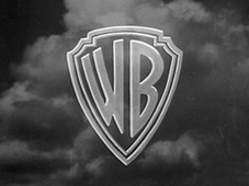
Visuals: Over a cumulonimbus cloud setting, a white "W-B" shield zooms in before stopping in the center of the screen.
Variants:
- For colorized releases, mainly Captain Blood, the cloud background is blue and the shield is yellow.
- On earlier films, such as Here Comes the Navy, Housewife, and Dames (all 1934), the shield is seen on a plain backdrop. Also, the camera zooms towards the shield instead of vice versa.
- Sometimes, the words "WARNER BROS. PICTURES, Inc. Present" appear over the shield.
- On The Goose and the Gander (1935), the shield is a still image, and is in the same style as the previous logo.
- On God's Country and the Woman (1937), the shield is different and resembles the shield bug as seen on the closing variant of the 5th logo.
- On the 1949 re-release of G Men (1935), the logo appears on a projection screen as the conclusion to the prologue.
Closing Title: On a special background, superimposed on the last scene of a movie or the cloud background of the opening logo, the words "The End" appear in a fancy script font, with either the WB or the FN logos and "Warner Bros. Pictures, Inc.", or rarely "Warner Bros. Productions Corporation", or "First National Pictures, Inc." below. The disclaimer was later changed to either "A First National Picture" or "A Warner Bros. Picture", and the font for "The End" would change different times.
Technique: Motion-controlled animation.
Audio: The opening theme of the movie.
Availability: Seen on films from the period, occasionally seen on TCM or preserved on Warner Archive DVD and Blu-ray releases. Examples are The Petrified Forest, Dames (1934), Captain Blood (1935), The Life of Emile Zola and Marked Woman (1937).
- This logo made its first known appearance is on Here Comes the Navy and made its final theatrical appearance on She Loved a Fireman.
Legacy: Elements of this logo (the zooming shield especially) have been implemented in the opening of Warner Bros. Cartoons (Looney Tunes and Merrie Melodies), which are regarded to be iconic.
4th Logo (November 27, 1937-July 3, 1948)
-

Early version
-

Early 1937-1938 variant
-

Revised 1937-1938 variant
-

1939 variant
-

-

-

-
-

-

-

French version
-

-

Turner colorized version
-

Alternate French version

.png)


.jpg)
_The_Treasure_of_the_Sierra_Madre.jpg)

-2.jpg)
_The_End.png)
_-_Closing_Variant.png)
_-_Closing_Variant_-_2.jpeg)
_The_End.png)
_2_(FIXED).png)
_-_Closing_Variant.png)
_-_Closing_Variant_-_2.png)


_%22The_End%22.png)
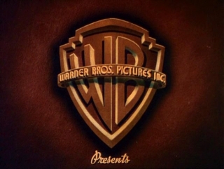
Visuals: On a dimly lit background, a more realistic version of the previous "WB" shield (this time without the hyphen) is shown. Wrapping around the shield is a metallic banner that reads "WARNER BROS. PICTURES, INC." The scripted word "Presents" appears below the shield.
Variants:
- On color releases, the shield is bronze and the background is red.
- Starting in 1942, the text "JACK L. WARNER, EXECUTIVE PRODUCER" is seen just below the banner.
- Starting in 1944, the word "PRESENTS" is now in the same font as the banner.
- On colorized versions of black and white films such as The Maltese Falcon and Casablanca, the logo has a blue background and a gold shield with a red interior.
- Some colorized films, such as The Big Sleep (1946), have the blue and red colors reversed, making the shield look very similar to the next logo.
- On Submarine D-1 (1937), the first film to feature this logo, the scripted word "Present" fades in on top of the shield instead of below it.
- On Tovarich (1937), the shield is the same as the Submarine D-1 variant, but the background is zoomed out to make room for the "Presents" text at the bottom.
- The revised 1937-38 versions of the standard variant have a slightly different background, which may actually be due to increased contrast levels. This is seen on films such as Jezebel and The Amazing Dr. Clitterhouse (both 1938).
Closing Title: Superimposed on a special background, or sometimes on the last scene of the movie, the large words "The End" (with the font varying depending on the movie) fade in, with a "WB" shield bug (which looks similar to the shield from the 3rd logo, albeit without the hyphen) and the text "A WARNER BROS. PICTURE" (with "WARNER BROS." usually in a scripted font). Sometimes, due to the deal between WB and First National Pictures, the disclaimer was changed to "A WARNER BROS.-FIRST NATIONAL PICTURE", or it was sometimes shortened to "A FIRST NATIONAL PICTURE" with the WB shield bug intact.
Technique: This logo was a painting filmed by a cameraman.
Audio: Usually the beginning of the movie's theme, or a majestic horn sounder composed by Max Steiner. On at least three films (To Have and Have Not, Confidential Agent and Dark Passage), a different fanfare composed by Franz Waxman is used.
Availability: Seen on Warner releases of the period, such as Casablanca on TCM and on DVD/Blu-ray, among others. It premiered on Submarine D-1 and made its final appearance on Romance on the High Seas.
Legacy: This is perhaps the second most well-known version of the shield, having preceded classics such as Casablanca, The Maltese Falcon and The Treasure of Sierra Madre, all starring Humphrey Bogart, who was named the Greatest American Movie Star (Men's Category) by the American Film Institute in 1998. This also marks the first appearance of the shield's iconic gold color.
5th Logo (July 31, 1948-November 1, 1967, February 7, 1974-August 31, 1979)
-

-

-

-

-

-

-

-

-

-

-

-

German variant 1
-

German variant 2
-

Scope Gem travelogues variant
-

-

-

-

-

-

German variant 3
-

French variant


.jpg)
.jpg)


.jpg)
.png)
Visuals: Same as before, but the design has been cleaned up a bit. The border of the shield, banner, text, and "WB" are now gold, and the inside of the shield is now blue. The text on the banner has been shortened to "WARNER BROS. PICTURES" and changed to a serif font. The scripted word "Presents", in the same font as the previous logo, usually appears below the shield. Also, the background has been changed to a set of clouds (much like the logos from 1984 on). For its later years, this logo was usually superimposed onto the opening scene of the film.
Variants:
- A B&W version of this logo exists, and appears on several films, the first of which was Key Largo.
- The logo may be occasionally superimposed over the opening shot of the movie.
- A sepia-toned variant of this logo can be found on Jack and the Beanstalk and Bonnie and Clyde.
- Some films, most notably The Crimson Pirate and The Master of Ballantrae, had this logo on a different cloud background.
- A different version was used on 3D films, as well as some 2D films that were originally planned to be made in 3D, such as House of Wax, Hondo, Dial M for Murder, Them!, The High and the Mighty, Rebel Without a Cause, East of Eden, Mister Roberts, The Court-Martial of Billy Mitchell, and Drum Beat (where this variant is presented in CinemaScope). Here the WB shield appears as a live-action model, the banner is straightened, and a different cloud background (which would be revived as part of the main logo beginning in 1984). This variant was used from 1953 until 1956, and was also used for plastering, such as for reissues of the 1951 film Force of Arms (aka A Girl for Joe).
- A variant with the "Presents" text absent appeared on Alfred Hitchcock's Under Capricorn, New York Confidential, and the 1961 Canadian film The Mask.
- Another rare version is seen on some Scope Gem travelogues like Alpine Glory. This variant uses a different cloud background, and has the 3D text "WARNER BROS. PICTURES PRESENTS", with "WARNER BROS. PICTURES" in a TCF CinemaScope-esque font, zoom towards the screen before stopping.
- Some films, most notably Battle of the Bulge and Cool Hand Luke, have this logo on a black background; a French variant of this also exists.
- Sometimes, the banner reads "WARNER BROS. PICTURES INC." like the previous logo, except the "INC." is very tiny and on the very right of the banner. This version can be seen on films such as The Prince and the Showgirl.
- A German version exists where the "Presents" text is replaced with "zeigen", and a white version of the shield is superimposed over the opening scene of the film. Another German variant, which uses the 3D version, has "zeigen" chyroned over the "Presents" text.
- On the Japanese release of None but the Brave (1965), the company name is written in Japanese.
Closing Titles:
- 1st Closing Title: Same as above, seen only with the "A Warner Bros.-First National Picture" and "A First National Picture" text.
- 2nd Closing Title: Superimposed on the last scene of the movie or a special background, the words "The End" (the font varies depending on the film) fades in, with the WB shield bug between two thick lines below. Sometimes, the following disclaimers were used:
- "Produced and Distributed by Warner Bros. Pictures, Inc."
- "Produced by Warner Bros. Pictures, Inc."
- "Produced and Distributed by Warner Bros. Pictures"
- "Distributed by Warner Bros."
These texts are seen sandwiched in between the words "The End" and the WB shield bug.
Technique: This logo was a painting filmed by a cameraman.
Audio: The Max Steiner horn fanfare from the previous logo was initially used for this logo, but it was gradually phased out in favor of the movie's opening theme.
Audio Variant: On New York Confidential, the logo has a different fanfare composed by Joseph Mullendore.
Availability: Seen on prints of many Warner Bros. films on AMC and TCM, and preserved on Warner Archive Collection or Warner Bros. Home Entertainment DVD releases.
- It also precedes the prologue in the 1949 re-release version of G Men.
- This logo made its first full-color appearance in The Rope and made its final appearance in Cool Hand Luke (copyrighted to Warner Bros.-Seven Arts, the film was completed by the time the merger had finished).
- The logo was briefly revived for a short time in 1974 starting with Blazing Saddles, and was later used on some films (albeit as a variation) until 1979, when it made its last appearance on Time After Time.
- Sometimes, this may be preceded by a later logo, as seen on the earliest home video releases of Them! (where the 10th logo preceded this one).
- This also appears on the VCI release of Drum Beat.
Legacy: This is the most well-known version of the Warner Bros. shield, according to the Movie title stills collection Warner Bros. website. This particular design was listed as the 12th best corporate logo by Complex Magazine for its longevity and iconic status.
6th Logo (January 20, 1968-November 12, 1970)
-
-

-

-

-

-

-

-

-

-

-

-

-

-

-

-

German version
-

Italian version
-

French version


.png)
_(Petulia).jpg)


.jpg)
.jpg)
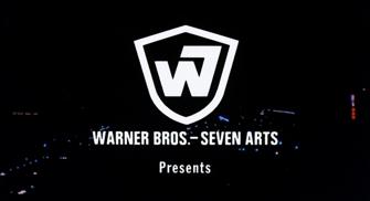
Visuals: A simpler shield with only the Warner Bros.-Seven Arts logo (a monogram of the letter "W" and the letter "7") appears superimposed over the opening scene of the movie, usually in white but sometimes in yellow or red, with the text "WARNER BROS.-SEVEN ARTS" below it. The "W7" is usually animated onscreen a la the NBC snake (although some films use a still variation), and the word "Presents" normally appears below the "WARNER BROS.-SEVEN ARTS" text .
Variants:
- Some films, such as Dracula Has Risen from the Grave (1968) and Frankenstein Must Be Destroyed (1969), have a still version of this logo.
- Some European movies distributed by Warner Bros., such as Alexandre le bienheureux (1968) and The Bastard (1968), have only the letters without the shield outline. On The Bastard, the logo is on a cloudy background like the previous logo.
Closing title: After the words "The End" and the credits, the words "Distributed by Warner Bros.-Seven Arts" are seen superimposed over the last scene of the movie or on a special background, with a W7 shield bug below.
Technique: Cel animation, sometimes composited over the opening scene of a specific movie.
Audio: None or the film's opening theme.
Availability: Seen on some Warner Bros. films (during the Seven Arts-era of the studio) of the period; however, it's usually replaced with a newer logo on re-releases of certain films, such as on pre-1998 prints of Bullitt (which plaster this logo with the 1984 Warner Communications "Shield of Staleness", with the exception of the 1980 WCI Home Video release) and on the WCI release of The Green Berets (which plaster it with the 1972 "Big W").
- The current DVD/Blu-ray release of Bullitt, and current prints of Charro and The Wild Bunch have their logos intact/restored.
- Also seen after the 1984 Warner Communications shield logo on The Arrangement, which aired on an international feed of TCM.
- This occasionally plastered the previous logo, such as on early VHS releases of East of Eden.
- The plaster originally was not used in Reflections in a Golden Eye (the first film to be released under Warner Bros.-Seven Arts) and Camelot, but it debuted on The Vengeance of Fu Manchu and made its final regular appearance on Last of the Mobile Hot Shots, subsequently appearing on Frankenstein Must Be Destroyed, Moon Zero Two, Once You Kiss a Stranger, The Phynx, Crescendo, and The Rise and Rise of Michael Rimmer.
Legacy: This is the first time the WB name (and its logo) saw major change in its 50+ year history.
7th Logo (February 4, 1970-February 25, 1972)


_20200831_160935.png)


.jpeg)
Visuals: On a blue background, an abstract, golden shield (akin to the one used on posters for 1950s and 1960s Warner Bros. films) with a dark brownish interior is shown. The word "WB" (this time not stylized) takes up the upper portion of the shield, and a rectangle in the same colors appears on top of the bottom portion, with the Kinney byline inside. The word "PRESENTS" normally appears underneath the logo.
Bylines:
- February 4, 1970-June 25, 1971: "A KINNEY NATIONAL COMPANY"
- April 8-May 1, 1971: "A KINNEY SERVICES COMPANY"
- June 17-September 30, 1971: "A KINNEY LEISURE SERVICE"
- December 19, 1971-February 25, 1972: "A KINNEY COMPANY"
Variants:
- Sometimes at the end of the film, the text "Distributed by WARNER BROS." or "Distributed by WARNER BROS. INC." is seen above (or, in the case of THX-1138, underneath) a superimposed version of this logo. Earlier films from 1970, such as Chisum and The Battle of Cable Hogue, have no rectangle or byline on the shield.
- German prints of There Was a Crooked Man... have a (.*) variant with the text in German and a cheaper version of the shield.
- Some films (including There Was a Crooked Man... and THX-1138) had the logo on a black background.
- Others (such as The Omega Man) had it superimposed over the opening credits.
- Dirty Harry and Billy Jack do not have the "PRESENTS" text.
- Some films, including McCabe and Mrs. Miller, had a two-dimensional version of the shield in white over a black background.
- On the 1970 print of the 1956 film Giant, the Kinney Shield appears over the classic WB clouds. It is unknown if this variant is preserved on any home video release.
Technique: This logo was a painting filmed by a cameraman.
Audio: Again, the opening/closing theme of the movie's theme or silence.
Availability: Can be found on movies such as Chisum, Dirty Harry, The Omega Man, The Cowboys, Billy Jack, and THX-1138, as well as the Criterion Collection Blu-ray of Death in Venice (where it was previously plastered by the 11th logo).
- This logo made its first appearance on Start the Revolution Without Me and made its final appearance on Dealing: Or the Berkeley-to-Boston Forty-Brick Lost-Bag Blues. What's Up, Doc?, the next film WB released, instead uses the classic WB shield as an in-credit logo, and would be the first film to use the Warner Communications byline.
- As we all know, Warner was incredibly shoddy with logo preservation until the early 2010s. AMC and TCM showings of Warner movies may include this logo, but one of its more current counterparts, most likely the Warner Communications and Time Warner (not Time Warner Entertainment) variations, may appear instead.
- This logo is removed on the 2007 DVD/Blu-ray release of A Clockwork Orange, but is preserved on the 2000 DVD release. It appears that the reason why this logo was plastered so often is because Kinney still existed as a company at the time, having spun off Warner Communications following a parking scandal, similar to what happened with United Artists and its Transamerica logos.
- The cheaper German shield version was found on an ARD airing of There Was A Crooked Man... from August 28, 1982.
- The Kinney Services byline, the rarest of the byline variants, appeared on Billy Jack, and is also presumed to have appeared on Zeppelin and Summer of '42.
Legacy: This shield's simplistic design reflected the style of other logos produced in this time frame.
8th Logo (November 24, 1971-February 2, 1972?)
-

-

French variant

.jpg)
Visuals: On a background similar to the last logo, a bannerless WB shield is seen, with the design closer resembling the classic WB shield. "A KINNEY LEISURE SERVICE" is seen below.
Trivia: This logo is based on the print logo that Warner used during the Kinney era.
Variant: A French variant exists, where "présente" in white fades in below the logo.
Technique: This logo was a painting filmed by a cameraman.
Audio: None, or in the case of The Man in the Wilderness, the opening audio.
Availability: Seen on The Man in the Wilderness and preserved on the Warner Archive Blu-ray.
- May have been seen on other films from this time period (it's confirmed to also be on a later Kinney-era film, possibly Snow Job), but it's hard to say between Warner's rampant plastering habits and more common usage of the 7th logo.
- Not helping matters is how even the aforementioned Man in the Wilderness used the Kinney Shield as its closing logo.
9th Logo (10th logo placeholder) (May 24, 1972-January 31, 1973)
_%27Dracula_A.D._1972%27_(Opening).png)
_%27Super_Fly%27_(Opening).png)
.png)

.png)
Visuals: The standard WB shield logo, without the banner, appears on a blue background with "A WARNER COMMUNICATIONS COMPANY" underneath. "Presents" in script may appear below.
Variants:
- This logo is often superimposed over the opening scene of a film.
- On some Warner VHS releases of titles like Deliverance, the aspect ratio is squeezed into 4:3 full screen from a wider ratio.
- On Get to Know Your Rabbit, the logo is darker and slightly tilted to the left.
- On the 2007 DVD and Blu-ray of Deliverance, "Presents" underneath the byline is not present. This is likely due to said release using the original negative as the basis for its restoration as opposed to a 35mm inter-positive.
Technique: This logo was a painting filmed by a cameraman.
Audio: None or the opening theme of the film, although Get to Know Your Rabbit uses a horn-driven theme with a flute mixed in towards the end.
Availability: This was another placeholder logo only used on a few films to begin with, including Deliverance, The Candidate and Super Fly.
- However, due to Warner's plastering habits, this was subject to being replaced with either the next logo below or the 1984 shield logo and its later variations.
- It is currently intact on the DVD release of The Candidate and the 2007 DVD and Blu-ray of Deliverance, as well as airings on TCM Australia and Fox Classics.
- Grit TV retains the logo on airings of Jeremiah Johnson.
- This logo is also preserved on the 1986 VHS and Betamax release of Rage, along with the 1994 VHS and Warner Archive Blu-ray of Dracula A.D. 1972 and the Warner Archive Blu-ray release of Super Fly.
- This logo premiered on Malcolm X (the previous WB feature, What's Up, Doc?, used a variant) and made its final theatrical appearance on Steelyard Blues.
10th Logo (February 7, 1973-1989)

_%27A_Star_Is_Born%27_(Opening).png)

.png)
_%27Night_Moves%27_(Opening).png)
.png)
.png)
.png)
.jpg)
Visuals: On a black background, an abstract "W", consisting of two slanted elongated circles and a shorter elongated circle, zooms towards the camera. Around halfway through, the words "WARNER BROS" (in a modified version of Handel Gothic) appear below it as it zooms in. The red "W" overtakes the screen as a smaller white "W" zooms in. It stops in the middle of the screen, and a rounded black square fades in around the "W". The byline "A WARNER COMMUNICATIONS COMPANY", in the same font as "WARNER BROS", fades in below. Most of the time, "PRESENTS" also fades in below (in Helvetica).
Trivia: The "Big W" was designed by Saul Bass, who also designed the Geffen Pictures "G" logo. The "Worms" nickname is attributed to an audio commentary for the film Gremlins, which brought back the shield logo. The \\' logo was seen in several other shapes like a circle and a parallelogram, but these prototypes were scrapped. Although this logo has since been retired by the studio, it is still used by the now-unrelated Warner Music Group (formerly owned by Time Warner).
Variants:
- On All the President's Men, the logo is in black and white and "PRESENTS" is absent (this variant is preserved on the DVD release). On old VHS releases (including the 1980 WCI release and the 1991 letterboxed French Canadian Warner release), the color is simply faded.
- On some films (including Oh, God!, The Frisco Kid, The Bugs Bunny/Road Runner Movie, Just Tell Me What You Want, Private Benjamin, The Looney Looney Looney Bugs Bunny Movie, Firefox, The Man with Two Brains, National Lampoon's Vacation, and Daffy Duck's Movie: Fantastic Island), "PRESENTS" fades in at the same time as the Warner Communications byline.
- On Superman and Beyond the Poseidon Adventure, a white "W" zooms in on a black background and stops in the middle. The words "RELEASED BY WARNER BROS" fade in below. (Superman retained this on early video releases, but it was replaced by the regular version on later releases, and the 1984 version of the shield on later video releases. It was restored on the film's DVD and Blu-ray releases. Current prints of the film replace it with the variant seen on Flags of Our Fathers).
- On some other outside productions released by WB (including Superman III), "RELEASED BY WARNER BROS" replaces "WARNER BROS" at the beginning of the logo (this version was retained on the original video release of Superman III).
- Some prints of Superman II and III have this variant, but the text is in a different, bolder version of the font. The "W" logo also appears reanimated in this variant, with the "RELEASED BY WARNER BROS" disclaimer appearing once the "W" fades in.
- On Exorcist II: The Heretic, there is a still image of a black "W" inside a red square field, with "WARNER BROS, A WARNER COMMUNICATIONS COMPANY" below.
- On Night Moves and Dog Day Afternoon, the word "PRESENTATION" appears below the Warner Communications byline, making the phrase "A WARNER COMMUNICATIONS COMPANY PRESENTATION".
- On the 1984 VHS release of Class of '44, the logo's 2.35:1 aspect ratio is squeezed into 4:3 full screen.
- On trailers for re-releases, the logo has a copyright notice at the bottom, with "A RE-RELEASE FROM WARNER BROS." above. This has been seen on reissue trailers of Superman and Around the World in 80 Days.
- There is a short version that starts with the white "W" zooming in. This can be seen on the trailer for McQ.
Closing Variants:
- The closing "DISTRIBUTED BY WARNER BROS" logo has the colors switched, with the "W" in black and the circle in white. This was seen as late as 1988 on Evil Angels, with an in-credit variation appearing as late as 1990 on The Witches. Sometimes, on redrawn Looney Tunes cartoons, it fades from the end cards.
- A B&W version of the closing "DISTRIBUTED BY WARNER BROS" logo also exists, which appeared at the end of a January 12, 1993 airing of S01E08 of F Troop on Nick at Nite.
- An early version of this logo had a different font for the text as well. This version appeared at the beginning of some prints of The Shining.
- A black-and-white version appeared at the end of TCM's print of Onionhead (1958), followed by the 2003 Warner Bros. Television logo in color.
- An ITV overnight showing of the 1968 film The Heart Is a Lonely Hunter in early September 1996 had its original W7 logo at the beginning, but this logo, with "PRESENTS", oddly appeared at the end.
- Some early WCI Home Video releases have this closing variant sloppily tacked on at the end of some features, and replacing the Warner Bros. distribution logo at the end of early video prints of Mister Roberts (1955) and replacing the National Pictures distribution logo at the end of the WCI print of Executive Action (1972).
Technique: Motion-controlled cel animation. A still graphic for the closing variant.
Audio: Usually silent, but sometimes the film's opening theme plays over it.
Audio Variant: Oddly, on Warner Archive's Blu-ray release of The Drowning Pool, it has the second half of the 1999 fanfare playing due to a plastering error, using the 2001 prints. The audio was taken from the Blu-Ray release of Gods & Generals.
Availability: It premiered on The Train Robbers and made its final regular appearance on Lassiter, subsequently appearing on Finders Keepers and Irreconcilable Differences (as seen on the Vestron Video release and the 2009 Lionsgate DVD, as it uses the same VHS master).
- Warner Bros.' editing bug in the '80s and early '90s meant that Warner Communications and Time Warner shield logos were seen over this logo and, ironically enough, that this did some plastering of its own back when it was the current logo, as seen on early WCI/Warner VHS and Betamax releases of The Green Berets (originally had the 6th logo) and The Candidate (originally had the 9th logo).
- This logo has started to resurface again on most newer remasters on most 1973-1984 films.
- Though films from The Ladd Company did not use this logo, this precedes that company's logo on the original rental-only VHS and Betamax release of Looker.
Legacy: This logo was noted as being "drastically simpler" than the studio's previous logos, mainly due to the absence of the shield, and was even considered to be "a touch Nazi-like" by Fast Company magazine. Nonetheless, it's still a favorite of many, including those in the movie industry, including Ben Affleck, Steven Soderbergh, Todd Phillips, and Clay Kaytis, who opted to use it on their respective movies Argo, the Magic Mike movies, Joker, and A Christmas Story Christmas.
11th Logo (April 13, 1984-February 2, 2001)
-

-

PROCHAINES SORTIES CINEMA variant
-

-

.png)
.jpg)


-

1992-1994 variant (16:9)
-

1992-1999 variant (16:9)
-

1992-1994 variant (4:3; open-matte)
-

1992-1999 variant
-

Early scope variant (1992-1995)
-

Scope variant (1992-1997)
-

1992-1999 variant (4:3; open-matte)


.jpg)
.png)

.png)


.png)
_Willy_Wonka.jpg)


.jpg)

.png)

.png)


.jpg)
.png)
.png)
Visuals: Over a set of clouds (the same set used in the 1953 variant of the 5th logo), the WB shield appears (including the banner reading "WARNER BROS. PICTURES" in a set of boxes), with the byline of the owner at the bottom.
Bylines:
- June 8, 1984-September 14, 1990: "A WARNER COMMUNICATIONS COMPANY"
- March 9, 1990-February 26, 1993: "A TIME WARNER COMPANY"
- August 14, 1992-February 2, 2001: "A TIME WARNER ENTERTAINMENT COMPANY"
Variants:
- Some films coincidentally modify the shield, with the color inside of the shield being changed to a more greenish tone.
- During this logo's duration, the sky background came in three colors: pale blue, dark blue and light blue.
- For some earlier films, and also for films that had this logo plastered on over older logos, the word "PRESENTS" fades in after a couple of seconds, like on WB films that originally used the 9th logo. This logo was also seen in black and white when added to the beginning of some films, such as Onionhead.
- Scope films used a different, more stylized cloud background, which was also used for this logo's television counterpart during the Warner Communications era. The clouds in this background are also more uniformly fluffy in appearance.
- A French variant used an animation of the shield and byline (which strangely still uses the Warner Communications text, despite it being replaced by Time Warner by then) glowing on a black background before flashing to the shield and background, with the text "PROCHAINES SORTIES CINEMA" (French for "UPCOMING CINEMA RELEASES") zooming out and shining. An announcer says "Et maintenant découvrez en exclusivité les bandes annonces des prochaines sorties Warner Bros disponible d'ici quelques mois chez Warner Home Video" (roughly translating to "And now discover exclusive trailers for the next Warner Bros. releases, available in a few months from Warner Home Video").
- Open-matte and bylineless versions also exist.
- A later variant modifies the banner slightly to remove the boxes the text is embedded in.
Closing Variants:
- 1984-1998: The closing logo, which appears at the end of most movies, features a simple superimposed WB shield (without a banner), much akin to the logo Warner briefly used before the introduction of the "Big W" logo in 1972. The phrase "DISTRIBUTED BY WARNER BROS." appears above the shield with the owner byline at the bottom. Beginning with The Perfect Storm on June 30, 2000, the above text is changed to "DISTRIBUTED BY WARNER BROS. PICTURES", and a URL is also added below the byline.
- A German variant exists, where the text reads "Im Verleih der WARNER BROS. FILM GMBH", which translates to "A Film of Warner Bros. GmBH". The shield is also redrawn.
- Films released from 1984 to roughly 1989, would use the 1972 "Big W" logo after their credits.
- A few movies would use a variant where the "Big W" logo is bigger than normal.
- On films released from 1986 to 1990, the credit logo used the previous logo font with a WB shield.
- On some films, like Goodfellas and Something to Talk About, the shield uses its 1953 alternate design.
- A variation of the credit logo exists, which appears at the end of The Bonfire of the Vanities and Curly Sue with the WB shield and below that "Distributed by Warner Bros., A Time Warner Company".
- December 8, 1988-March 22, 2000: Another ending variation features the movie logo, but with the words "DISTRIBUTED BY WARNER BROS." above the shield. This also appears at the beginning of Freejack.
- A 16:9 stretched to 4:3 variant also exists.
- May 12, 2000-February 2, 2001: Only the words "DISTRIBUTED BY" appear above the shield, and the text on the banner is redone. Some films like The In Crowd, Get Carter and Miss Congeniality have the banner simply reading "WARNER BROS.". A URL is also added below the byline. There is also a print closing logo, which appears at the end of Invictus.
Technique: This logo was a painting filmed by a cameraman, and later a digital graphic. Fading effects were used for the "PRESENTS" text on the original Warner Communications variation.
Audio: None or the opening theme or audio of the film.
Audio Variants:
- On the Warner Archive DVD-R release of How Sweet It Is!, the logo is accompanied by the National General fanfare (the original distributors of the film) as the result of a plastering error.
- On a Kabel 1 airing of It's Alive III: Island of the Alive (1987), the logo is accompanied by the 1985 Warner Home Video rendition of the Max Steiner fanfare due to another shoddy plastering job.
Availability: The 1992 version is usually the one that plasters older logos. Fortunately, WB has eased up on this somewhat, and older logos have been seen more often in recent years on newer prints/masters.
- This logo made its first appearance on Swing Shift (released on April 13, 1984) and made its final regular appearance on True Crime (released on March 19, 1999). The closing version made its final appearance on Valentine (released on February 2, 2001).
- The 1992 variant of the logo also does not appear on Space Jam, as NBA sold the rights distribution to Time Warner, but only the Warner Bros. Family Entertainment logo appears at the beginning instead.
- However, the trailer, in-credit variant, and scenes feature this logo.
- Neither this nor the 2009 sky background version of the 20th Century Studios logo appear on the 20th Century Studios Home Entertainment 4K release of the Regency film Heat, only the Regency logo appears instead.
- The Warner Communications byline version appears on both the 1997 DVD and the 2022 4K UHD Blu-ray releases of National Lampoon's Christmas Vacation (1989) (the 2003 DVD release has the 1998 logo with the AOL Time Warner byline), current DVD and Blu-ray prints of The Dead Pool, TCM prints of The Goodbye Girl, and the Blu-ray release of Full Metal Jacket (1987).
- However, it's not as easy to spot as the 1992 variant, as many DVD releases and Encore/Starz prints replace it with the Time Warner Entertainment byline variant, such as on the DVD release of Pee-wee's Big Adventure or even with the next logo below (occurs on the Police Academy films and Moving).
- Even the 1990 Time Warner byline variant has also been plastered with the next logo on most of Encore's prints of films released from 1990 to 1992, but it is still intact on the Blu-ray release of Goodfellas, the 1999 DVD and 2017 Warner Archive Blu-ray releases of My Blue Heaven, and the 2000 Director's Cut DVD release of Lethal Weapon 3.
- One instance where this logo does some plastering of its own was on The Ballad of Cable Hogue, where it plastered the Kinney Shield.
- The 1984 Warner Communications "Distributed by" variant also appears at the end of the 1999 DVD release of The American President (1995) of all places, likely due to a printing error when editing out the Columbia Pictures in-credit closing logo.
- The 1984 Warner Communications opening variant also strangely plasters the New Line Cinema logo on the 2018 Criterion Collection DVD releases of Female Trouble (1974) and Polyester (1981).
- It also makes an even stranger appearance on the Mystery Science Theater 3000 version of Catalina Caper, a Crown International film (it appears to have been sourced from a television print from around 1987); it appears as Joel and the Bots are entering the theater.
- It also appears at the start of Blazing Saddles (1974) on the 1996 UK VHS re-release thereof, and Dirty Harry (1971) on the 2000 UK VHS re-release thereof, both from Warner Home Video.
- It also appears at the start of newer prints of Bugs Bunny's Looney Christmas Tales (1979), which appears on the 2007 DVD release of Looney Tunes Golden Collection Volume 5.
- The 2000 closing variant of the logo also appears at the end of a 2001 Dish on Demand airing of Pokemon the Movie (2000), which is then followed by the 1995 Warner Bros. Domestic Pay TV, Cable & Network Features logo.
Legacy: This logo reverts to the 1948 shield, later used for the 1998 logo. However, the 1992 variant is disliked by many people for its large-scale plastering, giving it the unofficial nicknames "Shield of Staleness" or "The Shield of Annoyance".
12th Logo (January 16, 1998-March 18, 2022)
-

-

-

-

Normal version, 4:3
-

"WARNER BROS." version, 4:3
-

With copyright stamp, 4:3
-

With copyright stamp, scope
-

"WARNER BROS." banner variant with copyright stamp
-

French variant


.png)
.jpg)

.jpg)
.png)
-

16:9
-

Scope
-

4:3
.png)
.png)
.jpeg)
-

16:9
-

Scope
-

Scope #2
-

4:3
-

Rare "STUDIOS" variant
.png)

.png)
.png)
.png)
-

Prototype byline
-

Prototype byline scope version
-

Official byline
-

Official byline scope version
-

Official byline scope darker version
-

Official byline fullscreen version
-

IMAX 3D version
-

IMAX 3D fullscreen version
-

IMAX 3D scope version
-

Official byline (4K HDR)
-

2011 enhanced version
-

2011 enhanced scope version
-

2011 enhanced scope darker version
.jpg)
.png)
.jpg)
.png)
).png)
.jpg)

.jpg)
.png)


).png)
.png)
-

16:9
-

1:85:1
-

Scope
-

2019 variant (WarnerMedia Day)
).png)

.jpg)
-

Zoomed bylineless version, only seen on 2003 prints of Terminator: Rise of the Machines

_1.png)
.png)
.jpg)
_2.png)
.png)
.png)
.png)


.jpg)

_(scope).png)
.jpg)
.jpg)
Visuals: A picture of the Warner Bros. Studios in Burbank is seen with a gold tint, and ripples slowly (a la the DreamWorks Pictures logo) before rotating to reveal itself as the WB shield over the cloud background, both of which are now redone in CGI. The shield continues to rotate as it zooms out to its usual position, with the company byline fading in underneath.
Trivia:
- If one pauses right before the transition from the backlot image to the shield animation, some posters can be seen on the studio wall, including those for Lois & Clark: The New Adventures of Superman, Friends, and Space Jam, dating the photograph to sometime between mid-1996 and early 1997.
- The cloud background in the logo would be reused on the 2002 OwlSightings.com commercial to promote both the May 28, 2002 VHS and DVD releases of Harry Potter and the Sorcerer's Stone.
Bylines:
- January 16, 1998-February 2, 2001: "A TIME WARNER ENTERTAINMENT COMPANY" (in the Garamond font in the normal variant, but in the Bodoni Condensed font in the 75 Years variant)
- On some scope films starting in 1999, the byline is noticeably larger.
- February 16, 2001-September 12, 2003: "An AOL Time Warner Company" (also in Garamond)
- On some scope films such as Training Day, the byline is noticeably larger.
- On the 2003 DVD release of Terminator 3: Rise of the Machines, the byline gets cropped out, using its 16:9 version, meaning that it's bylineless, like the Warner Bros. Family Entertainment logo. This only applies for widescreen copies.
- November 5-December 5, 2003: "A Time Warner Company" (in Adobe Garamond Pro)
- December 12, 2003-August 24, 2018: "A TimeWarner Company" (with "TimeWarner" in its own custom font, called Bodoni BE Regular, while the rest of the byline is in FF Meta)
- On the Warner Animation Group films Storks and The LEGO Batman Movie, the byline (excluding "TimeWarner") is in the Proxima Nova font and is smaller.
- July 22, 2018-November 26, 2020, March 31, 2022: "A WARNERMEDIA Company", with "WARNERMEDIA" in its own logo font, called AT&T Aleck Sans Bold, while the rest of the byline is in the standard variation of the same font. The shadow behind "MEDIA" is also absent.
- October 29, 2019-March 31, 2021: "a WarnerMedia company", with "WarnerMedia" in its own logo font, called AT&T Aleck Sans (modified), while the rest of the byline is in the standard variation of the same font. It was seen on Godzilla vs. Kong (albeit using a custom variant) and strangely, it uses the 14th logo at the end. It was also spotted in the first trailer for Tom & Jerry (2021) and at the Warner Bros. segment in HBO Max's unveiling at the 2019 WarnerMedia Day, which was shown on the stage monitor behind the Chair & Chief Executive Officer of Warner Bros., Ann Sarnoff, alongside the Warner Bros. Television Group logo on both sides of the stage.
Variants:
- January 16-December 18, 1998: For the logo's debut and its first official year (1998), "75" and "YEARS" slide out from behind the shield as it zooms out to a farther distance to accommodate for the text. "Entertaining The World" fades in underneath, followed by the Time Warner Entertainment byline in white instead of orange. Also, the shield and the background are slightly enhanced. Sometimes, the banner may just read "WARNER BROS." instead of "WARNER BROS. PICTURES".
- There is a flat/open-matte and scope version of the logo. The flat and 1.37:1 "academy" versions vertically stretches the tinted picture of the Warner Bros. studio, while the cloud background is normal. The scope and open matte versions have the tinted photo as normal and the cloud background horizontally stretches as the shield zooms out further.
- On the 75 Years montage intro, a version exists where a copyright stamp "©Warner Bros. 1998" (uppercased in the Warner Bros. banner with a space between the copyright stamp "© WARNER BROS., 1998" and the company name) fades in with the Time Warner Entertainment byline (a la the 1997 Universal Pictures logo). This appears in both 4:3 and scope.
- A French VHS promo has the "WARNER BROS."-shield variant zooming out to its place, but it freeze-frames, and the text "75 ANS A VOUS FAIRE RÈVER" fades in.
- There is a 35mm promo version, where it has a randomized vignette on the logo.
- A short version of the "WARNER BROS." variant exists on a different promo from the company.
- February 5, 1999-2011: The logo is reanimated to remove the 75th Anniversary wordings. Also, the byline is now in orange. This version would stay the same until it was reanimated once again in 2011 (not counting the changes in bylines and color grading).
- The flat and scope versions are almost identical. The reflection of the studio from the banner is the same in the scope version while it is rendered differently in the flat/open-matte version.
- A somewhat enhanced WB shield can be seen on NASCAR 3D: The IMAX Experience, Clash of the Titans, Deep Sea 3D, Under the Sea 3D, Hubble 3D, Born to Be Wild 3D, and 3D international releases of Beowulf. The animation revealing the shield is quicker, the flash reflection on the banner when the shield is revealed is not as bright, the lens flare are different, the inside of the shield is a brighter blue, the banner around the shield is shinier, the cloud background is further back, and the shield zooms out further more. This version was most likely made to accomodate primarily the 3D and 15/70 IMAX formats.
- A version of the logo exists in which Bugs Bunny walks from the shield, does a Vanna pose, and eats a carrot. This version was used for Warner Bros. Family Entertainment for a short time in 2005.
- Starting with Dolphin Tale in 2011, the logo has been enhanced. The shield is sleeker, the banner is shinier, the byline is orange-yellow, and the animation revealing the shield has more detail. Some films like The Dark Knight Rises, Gangster Squad and most foreign films released by the company at the time used the 2003 version, with the last film overall using that version being the Chinese film Zhongkui: Snow Girl and the Dark Crystal, released in 2015. The shield rotating was reanimated as the rippling animation is zoomed in. In the scope version, it's zoomed in even more.
- On TV airings of Miss Congeniality, the byline underneath the 2001 version of the logo is blurred and reads "A TIME WARNER ENTERTAINMENT COMPANY" in the Arial font. It is unknown whether or not this variant was remade by technicians.
- On FX, FXX and FXM airings of The Negotiator, the 2003 version of the logo with the Time Warner byline is still.
- A promotional tape has the shield replaced with a shinier 2D shield with "WARNER BROS. STUDIOS" instead of "WARNER BROS. PICTURES" on the banner.
- Sometimes, the scope version of this logo is in 4:3 letterbox. Spotted at the end of 4:3 pan & scan prints of some films originally shot in that scope ratio.
Closing Variants:
- 1998-February 2, 2001, May 17, 2002, March 5, 2004: Same as the previous logo.
- February 16, 2001-November 26, 2020: This closing logo features the 1984 shield with the banner inscription updated to match that of the current opening logo; the words "Distributed by" (in the font depending on the version of the closing variant) appear over the shield with the "www.warnerbros.com" URL address underneath the byline (also depending on the version). This is pretty much a modified version of the 2001 Warner Bros. Television logo.
- February 16, 2001-December 5, 2003 (AOL Time Warner and prototype Time Warner bylines): The text "Distributed by" is in Garamond, like its television counterpart, while the "www.warnerbros.com" URL address is in bold below the byline reading either "An AOL Time Warner Company" or "A Time Warner Company".
- December 12, 2003-August 24, 2018 (official Time Warner byline): When the byline was changed to "A TimeWarner Company", the "Distributed by" was updated to the custom Didot/Bodoni hybrid font with the URL in FF Meta. Also, starting with this version, the sky background is different, however some films such as TMNT, It, The LEGO Batman Movie, The LEGO Ninjago Movie and Ready Player One used the old sky background instead.
- July 22, 2018-March 31, 2022 (WarnerMedia byline): Once again, the text above and below the logo and the byline was changed in favor of the byline change to "A WARNERMEDIA Company". Here, both "Distributed by" and the "www.warnerbros.com" URL are now in AT&T Aleck Sans typeface. Like the opening variant, the shadow behind "MEDIA" is not there.
- On The LEGO Batman Movie and The LEGO Ninjago Movie, it cuts in and cuts out instead of fading in and out.
- There's an alternate scope version with the shield being further zoomed out, much like the IMAX variant. This was spotted on We Are Marshall.
- A variant based on the opening logo appears in the 2016 German film Vier giegen der Bank.
- On Studio illegale, the last few seconds of the opening logo is used instead.
Technique: CGI by Intralink Film Graphic Design for the original 1998 and 1999 versions, and Picturemill for the 2011 version. The closing variant digitally alters the banner from the original painting.
Audio:
- January 16-December 18, 1998: A wind-blowing chime theme that samples the first seconds of the Non-Stop Music library track "Journey to Chung King", composed by Holly Anderson, followed by a sampled sound from the E-MU Emulator III.
- February 12, 1999-November 26, 2020: An 8-note piano tune that builds into a powerful, moving fanfare, based on the theme from Casablanca, "As Time Goes By", originally written by Herman Hupfeld (originally used in the Broadway musical Everybody's Welcome). It is a shortened version of an instrumental of "As Time Goes By" that appeared in a Warner Bros. 75th Anniversary promo that had been shown theatrically a year earlier. The fanfare made its debut in Message in a Bottle. The fanfare uses "Crescendo Finale" from Peter Siedlaczek's Orchestral Colors, and maybe an unknown cymbal sample (probably SampleCell II or Big Fish Audio Prosonus).
- On movies released during the AOL Time Warner Company byline's usage, the harp is quieter.
- When the Time Warner byline was introduced in November 2003, the harp was removed.
- In other cases, it uses the opening theme of the movie or none.
Audio Variants:
- A low tone version of the "As Time Goes By" theme exists, which is heard on an AMC print of Willy Wonka and the Chocolate Factory.
- The 16mm/35mm montage intro for the 75th anniversary of Warner Bros. uses an extended version of the "As Time Goes By" theme on the 75th Anniversary logo. The voiceover (voiced by Chuck Riley) thanks audiences around the world for celebrating 75 years.
- On Hearts in Atlantis, as well as current prints of Stealing Home and Cookie, and all PAL prints of films, the fanfare is high pitched (due to the former three using PAL prints). A double pitched variation exists on PAL prints.
- The intro video of Warner Bros. Studio Tour Hollywood has "As Time Goes By" from Casablanca (archival audio) transitioning into the 1998 fanfare, as soon as Sam (played by Dooley Wilson) sings the phrase "The fundamental things apply...".
- On Australian prints of the French film Love, Sex & Therapy (2014), the fanfare is a lot more reverbed than usual, with the piano (with the exception of the opening part) being almost inaudible.
- The Japanese live action movie, Gintama 2, had the last spoken dialogue echoing at the start of the fanfare for the latter two showings, in which the logo is shown three times as a running gag during the start of the movie, as shown below.
- On a sizzle reel dating from the 2000s, the cymbal hits are removed, and the ending flourish also sounds a bit different.
- On Studio illegale, one of the stereo audio tracks for the fanfare is missing, making the fanfare sound less powerful.
Availability: It first debuted on Fallen and appears on most of the company's films from this era until it was officially retired in 2022, with the final film to use this logo being The Nan Movie.
- The 75th Anniversary variant first appeared on Fallen and last appeared on You've Got Mail.
- However, probably due to the 75th Anniversary wordings, it is almost always plastered with the 2003 version on newer prints of such films, although some releases may still retain it.
- Pre-Disney prints of The Negotiator have made this logo next to the Regency logo.
- However, it is also removed on Star prints of The Negotiator, as it just cuts to the Regency logo instead.
- The 1999-2000 version was also spotted plastering older logos on some 1999-2001 prints of older films, such as the May 2001 DVD release of Superman II (where it plasters the 1972 logo).
- The AOL Time Warner byline debuted on Sweet November and last appeared on Matchstick Men.
- It also plasters previous logos on some 2001-2003 prints of older films.
- The prototype Time Warner byline is rare and first appeared on The Matrix Revolutions. It last appeared on The Last Samurai.
- However, it also makes a surprise appearance on The Polar Express (2004, albeit using a custom variant), and the trailer for Gravity (2013), with the 1999 version. It is also the only 2004 film release to have the prototype Time Warner byline, as all other 2004 film releases use the later/official Time Warner byline.
- The official Time Warner byline debuted on Something's Gotta Give (TV spots and trailers for the film use the prototype Time Warner byline instead), and made its last appearance at the end of the IMAX re-release of 2001: A Space Odyssey and on Bleach, released on July 20, 2018 in Japan.
- Just like the AOL Time Warner version, this byline also plasters previous logos on post-2003 prints of pre-2003 films (in addition, also plastering the 75th Anniversary, Time Warner Entertainment, and AOL Time Warner versions of the same logo).
- Several classic films, including the first two Lethal Weapon films (current prints of Lethal Weapon 3 still retain the 1990 variant of the 1984 logo), Superman II, III and IV: The Quest for Peace, The Exorcist, Mad Max 2: The Road Warrior (though the 1972 "Big W" logo is still retained on the original 1997 DVD release), The Lost Boys, Blazing Saddles, All the President's Men, Falling Down, Return of the Living Dead Part II, recent HBO Family airings of Casablanca (plastering the black-and-white 4th logo), and current prints of the National Lampoon's Vacation series (with the exception of European Vacation) have had their old logos plastered with this one in lieu of the 11th logo, though this one mainly appears on the most recent releases. The 2018 version with the WarnerMedia byline also plasters the previous logo on current prints of Steel (1997).
- The WarnerMedia byline version made its first official appearance on Teen Titans Go! To the Movies.
- This logo may or may not be plastered, or preceded by the Toho logo on Japanese prints of Legendary Pictures features distributed by Toho in Japan; it is known to have at least appeared on Japanese prints of Godzilla vs. Kong.
- The Japanese anime movie, Gintama: The Movie (subtitled A New Retelling Benizakura Arc in Japan) and the Japanese live action movie, Gintama 2 has the logo shown three times as a running gag during the start of the movie.
- The AOL Time Warner byline variant also makes surprise appearances at the end of Amazon Prime Video's print of Blue Collar Comedy Tour: The Movie and a TCM France airing of Ransom.
- This logo also appears at the beginning of pre-Disney prints to the feature-length movie, Star Wars: The Clone Wars, before the Lucasfilm logo.
- However, Disney+ prints of the film remove this logo after 2019, due to Disney's ownership of the Star Wars franchise since 2012.
- This logo also appears on the international theatrical prints for Man on the Moon and Wonder Boys (both produced by Mutual Film Company), although it does not appear on the home video releases.
- Strangely, this also appears on season 3, episode 10 of Suddenly Susan on The Roku Channel. The chimes from the 1998 Warner Bros. Television logo are also audibly heard before the logo even appears.
- Surprisingly, the 2011 enhanced Time Warner version is retained on current prints of Clifford's Really Big Movie where it is preceded by the 2013 Universal Pictures logo.
- This was used in tandem with the next logo, and later the 14th logo until March 18, 2022.
- It also oddly appears on Creed II, despite that film being produced by New Line Cinema.
- This may or may not appear on Italian prints of Sony Pictures Releasing-distributed films.
- However, this notably appears on Italian prints of Call Me by Your Name (2017), preceding the Sony Pictures Classics logo.
- The closing variant of the 2003 Warner Bros. Pictures logo also appeared at the end of a December 23, 2022 affiliate KNBC airing of How the Grinch Stole Christmas! (1966), plastering the 1960 MGM Television logo.
- The closing variant of the 2003 Warner Bros. Pictures logo also appeared at the end of the December 24, 2018 and December 31, 2022 UK airings of Escape to Victory (1981) on ITV4 and Channel 5, respectively.
- The closing variant of the 2003 Warner Bros. Pictures logo also appears at the end of the Warner Archive Collection 2017 Blu-ray release of Doc Hollywood (1991).
- The closing variant of the 2003 Warner Bros. Pictures logo also appears at the end of the Blu-ray release of Caddyshack (1980).
- The closing variant of the 2003 Warner Bros. Pictures logo also appeared at the end of the December 25, 2007 UK airing of The Polar Express (2004) on ITV1, which is then followed by the 10-second Motorola Flip Phones closing sponsorship ident.
- The 2003 Time Warner version also makes a surprise appearance at the start of the 2022 Umbrella Entertainment (licensed from Sony Pictures Home Entertainment) Blu-ray release of Tickle Me (1965), likely because it uses the same print as the North America-only VOD release.
Legacy: A favorite of many in the logo community thanks to its CGI and music.
13th Logo (14th logo prototype) (August 26, 2020-June 29, 2021)
.png)
.png)
.png)
.png)
Visuals: It starts the same way as the previous logo. After the lot "ripples" the redesigned WB shield comes into view fully upright unlike the preceding and succeeding logos and as it settles into place the clouds in the distance fade to black. "a WarnerMedia company" fades in below the shield in a modified AT&T Aleck Sans font.
Trivia:
- This is the first logo since 1972 to not have a banner around the shield.
- The new WarnerMedia logo was introduced on October 17, 2019, alongside with the byline, and was created by Wolff Olins.
- The new WB shield was introduced on November 13, 2019, and was created by Pentagram.
- As the shield pulls back, the clouds can be seen reflected within it.
Variant: On Judas and the Black Messiah, a still variant of the finished product was used. However, on Gintama: THE FINAL / Gintama: THE VERY FINAL, an animated variant of the finished product (where the shield just shines) was used instead.
Closing Variant: The logo already formed, with "Distributed by" above the shield (in AT&T Aleck Sans) and the web address below the WarnerMedia byline.
Technique: CGI.
Audio: The opening theme of the movie or none.
Availability: During the logo's usage, it was used in tandem with the previous logo.
- It debuted on Tenet and later appeared on Wonder Woman 1984 (as a variant).
- It also appeared at the opening of Gintama: THE FINAL / Gintama: THE VERY FINAL and the end of Cats and Dogs 3: Paws Unite! and A Cinderella Story: Starstruck.
- A still of this logo also appears during the opening of Judas and the Black Messiah (the next logo appears at the end).
14th Logo (January 14, 2021-)
-

The studio lot
-

The studio lot (scope)
-

1.85:1
-

16:9
-

Scope
_-_Studio_Lot.png)
_Studio_Lot_(scope).png)
.png)
.png)
.png)
-

Prototype variant (scope)
-

16:9
-

Scope
-

16:9 (cropped to scope)
.jpeg)
.png)
.jpeg)
.png)
-

Bylineless version, as seen on the trailer for Father of the Bride

Visuals: It starts off similarly to the last two logos, but this time, instead of a simple rippling image, the camera pans across a photorealistic CGI rendering of the Warner Bros. Studios backlot (with details such as numbers on the sound stages, the WB logo on Stage 16 and a red carpet outside the Steven J. Ross Theater), with the camera then moving to the left past the iconic water tower (displaying the "dimensional" version of the 2019 WB shield and "WARNER BROS. STUDIOS" in three rows on it in the Warner Bros. Sans font, based on the shield's lettering) as it takes center stage, similar to the Searchlight Pictures logo. After a few seconds, it continues the same way the previous two logos did, with the same 2019 WB shield from the previous logo (now brighter and more realistic) rotating as it zooms out like the 12th logo (with the letters and shield outline starting off in gold when it zooms out, a homage to its previous gold color, before subtly changing to platinum silver), revealing a more realistic, detailed cloud background. The byline then fades in below as the shield shines.
Trivia:
- In the 2021 film Space Jam: A New Legacy, the still version of the logo without the WarnerMedia byline is shown on a boardroom monitor at the end of the Warner 3000 pitch, with a different shield animation at the end, transitioning into the same logo as shown above. The same studio lot shown in the logo was also shown during the scene leading into the Warner Bros. Serververse. The cloud background in the logo (with the WB shield covered up by windows) was used as the desktop background in a Dell monitor on the Warner Bros. executive's (played by Sarah Silverman) computer. Furthermore, the entire studio lot made another appearance in A Hollywood Christmas.
- The logo depicts the sun rising over the Cahuenga Pass to the south. In real life, the sun rises in the east, over the Forest Lawn Cemetery and the Walt Disney Studios.
- If one looks closely on one of the buildings shown in the lot, a courthouse (which used as a building of the Gotham City Police Department from the 1966 Batman TV series) can be seen in Embassy Courtyard.
- As you can see the Steven J. Ross Theater on the WB studio lot, there is a missing detail on this where there is the text saying "WARNER BROS. ARCHIVE" which uses the Goudy Old Style font and a Warner Bros. Studio Tour Hollywood poster behind the theater.
Bylines:
- January 14, 2021-August 11, 2022: "a WarnerMedia company", with "WarnerMedia" in its own logo font, called AT&T Aleck Sans (modified), while the rest of the byline is in the standard variation of the same font.
- June 16, 2022: "a Warner Bros. Discovery company", with "Warner Bros. Discovery" in its own logo font, called AT&T Aleck Sans, just like the WarnerMedia byline, while the rest of the byline is in the standard variation of the same font as a placeholder, just like CNN's usage of the WBD byline at the end of programs from CNN International, like CNN Newsroom (International) and The Global Brief, except for the company's name, in which has the Geograph Medium font and is uppercased, making it a mix between the placeholder and the official WBD bylines.
- June 24, 2022-: "A WARNER BROS. DISCOVERY COMPANY", with "WARNER BROS. DISCOVERY" in its own logo font, called Geograph Medium, which is created by Klim Type Foundry and has been designed exclusively for National Geographic, while the rest of the byline is in the standard variation of the same font.
Variants:
- Sometimes, the sun appears first, and then its glow and the rest of the footage of the studio lot fades in.
- On films shot in scope (2.39:1), the shield and byline are smaller.
- Some films, notably Holiday Harmony and a Thai trailer for Suzume (in which the company handled distribution there), have the 16:9 variant cropped to 2.39:1 aspect ratio.
- A version exists where the logo doesn't fade in or fade out. This version may or may not have music. This can be seen on Devastudios' website, Michael Daniels' website, Dune (2021; albeit using a variant with a fade out), Sexo, Pudor y Lágrimas 2 (Sex, Shame and Tears 2), and the end of the 4K Blu-ray release of both the theatrical version and the director's cut version of The Outsiders: The Complete Novel.
- A "behind-the-scenes" version of this logo exists, showcasing the different production stages of the backlot, water tower, clouds, and the WB shield.
- Sometimes on the closing variant, the logo is entirely still. This can be seen at the end of YouTube prints of Thir13en Ghosts, plastering the 12th logo.
- The intro video of Warner Bros. Studio Tour Hollywood follows the same transitions for both the normal and New Line Cinema versions from the 12th logo. In the New Line Cinema version, it is slowed down to fit the video's length. The major difference is that it was in a 16:9 (1.78:1) ratio instead of the usual 21:9 (2.35:1) ratio from the previous logo.
Closing Variant: The tail end of the opening logo with no extra text. Here, the logo stays on-screen for at least four extra seconds before fading out. This is the first time that the "Distributed by" text above is not used, and the first time since 2000 that the URL below is absent.
Technique: CGI by Devastudios (who previously animated the logos for Lionsgate Films and Paramount Pictures in 2005, 2011 and 2013 respectively). Due to coronavirus (COVID-19) restrictions, the backlot was created using drone footage, original blueprints from the Warner Bros. Studio Facilities and available photography and videography from Warner Bros. Studio Tour Hollywood and Google Earth, all in order to reconstruct it in CGI. The sky and clouds were created with Terragen from Planetside Software. More info can be read on Devastudios' website.
Audio: A re-orchestrated version of the 12th logo's theme, now in a different key (this time in E♭ major). It has a more powerful, orchestral buildup, and the opening notes are now played on a guitar and flute as opposed to a piano. This was composed by Ludwig Göransson. It is currently unknown what samples are used (probably Spitfire Audio or Cinesamples).
Audio Variants:
- Some films, most notably the first few to use this logo, have either the opening theme of the movie or silence.
- An upload of the logo on Billy Mallery's Vimeo page has an alternate fanfare which is based on the "As Time Goes By" theme, composed by Mallery himself. It wasn't used on any films as this was a "runner up" score. It is unknown if other runner up versions from other composers exist.
- On the intro video for Warner Bros. Studio Tour Hollywood, the 1999 arrangement of the fanfare is used, transitioning from "As Time Goes By" from Casablanca (archival audio), as soon as Sam (played by Dooley Wilson) sings the phrase "The fundamental things apply...".
- On Bernadette and Hawaii (both French films), the November 2003 version of the 1999 fanfare from the 12th logo is used, just like the Warner Bros. Studio Tour Hollywood variant.
Availability: This was used in tandem with the previous logo until June 29, 2021, and the 12th logo until March 18, 2022.
- It first debuted on the HBO Max original movie Locked Down (the 12th logo appears on the UK trailer for said film instead).
- The logo with the fanfare debuted on Non Mi Uccidere (Don't Kill Me) and Rurouni Kenshin: Final Act - Part 1: The Final, released on April 21 and 23, 2021 in Italy and Japan, respectively; and later made its North American debut on King Richard, released on November 19, 2021.
- This also appeared at the end of Judas and the Black Messiah, despite using the previous logo at the beginning of the film, and also at the end of Godzilla vs. Kong, despite the 12th logo (albeit using a custom variant) appearing at the beginning of the film.
- This logo also appeared on the 2021 director's cut of Justice League (titled Zack Snyder's Justice League; both the regular and B&W (Justice is Grey) versions) on HBO Max and the end of YouTube prints of Thir13en Ghosts, originally released in 2001.
- It also appeared at the end of the 4K Blu-ray release of the director's cut of The Outsiders: The Complete Novel.
- The WarnerMedia byline's final appearance was on Tang and Me, released in Japan on August 11, 2022.
- However, it later appeared on the television series Monarch: Legacy of Monsters.
- The prototype Warner Bros. Discovery byline only appeared on the HBO Max original movie Father of the Bride as a placeholder.
- The Warner Bros. Discovery byline made its official debut on Elvis, released on June 24, 2022 (albeit using a custom variant, while the standard variant first appeared at the end of the film), and later on the trailers of the Japanese films Karada Sagashi and Kin no Kuni Mizu no Kuni. The full version made its debut on the UK release of The Lost King, and later appeared on the U.S. on A Christmas Mystery on HBO Max.
- With the water tower having been repainted to have the Warner Bros. Discovery shield on it in 2022, the next logo was introduced in 2023 as a secondary logo, starting with The Flash, albeit using a variant. Despite that, this logo still appeared at the end of The Flash (as previously mentioned), Blue Beetle, and The Nun II, as well as on Barbie (also a custom variant) and Meg 2: The Trench.
- As the company formed a multi-year deal with MGM in August 2022 to distribute their films in some international territories, including on home video, this logo has started to appear with the MGM logo on the international trailer for Bones & All, and on international prints of the film itself.
- On theatrical prints of Warner Bros. films since 2021 in Australia, Mexico and Hong Kong, it is preceded by the 2012 Universal Pictures logo, and was notably found in theatrical prints of films like Dune, The Matrix Resurrections, The Batman, Air (distributed by Amazon Studios domestically) and Barbie in these aforementioned territories.
- On the other way around, this precedes the Universal logo on Indian theatrical prints of Universal films starting with Knock at the Cabin. Philippine and Brazilian theatrical prints of Universal films, despite handling local distribution by Warner, only show their own logo.
- This appears on many of the Singapore-based distributor, Encore Films releases in Southeast Asia before the latter company's logo. Notable appearances of this logo are on the Philippine and Thai theatrical release prints of Suzume, the Philippine theatrical print of The Wandering Earth II (preceding the China Film Administration logo), the Singaporean and Malaysian release prints of The Hunger Games: The Ballad of Songbirds & Snakes (released by Lionsgate domestically) and Immaculate (released by Neon domestically) as well as on the Southeast Asian theatrical prints of the Studio Ghibli film, The Boy and the Heron where Warner is the co-distributor. In this co-distribution arrangement, both the opening and closing logos are shown.
- It is also seen on Singaporean and Hong Kong theatrical prints of Expend4bles.
- This also appears on British theatrical prints of Hypnotic, preceding the Solstice Studios logo.
- As mentioned above, this also appears at the end of The Nun II and the trailer of said film, but it doesn't appear at the beginning of the film, instead opening with just the 1994-2010 New Line Cinema logo (albeit as a custom variant). This marks the first time since 2010 that this doesn't precede the New Line Cinema logo.
Legacy: A much more well-received logo from Warner Bros., due to its CGI and fanfare.
15th Logo (December 15, 2023-)
-

The studio lot (scope)
-

The studio lot (16:9)
-

Scope
-

16:9
-

16:9 (some clouds are removed)
_(studio_lot).jpg)
.PNG)
.jpg)
.jpg)
.png)
Visuals: An updated version of the previous logo, featuring the 2023 WB shield. The water tower on the studio lot now has the new Warner Bros. shield (with its banner) introduced in 2023. If one looks closely, the same WB shield (albeit bannerless) is also seen at Stage 16, replacing the 2019 shield. The image then ripples slightly (a call-back to the 1998 logo) before it reveals the shield, which is once again gold and blue and features a banner that has the company's name in the Warner Bros. Sans Condensed Bold font on it. The cloud background is also darker in color, unlike the previous logo. The WBD byline fades in below, although earlier this time as the shield nearly settles into its place. Then, like the previous two logos, the shield shines before the logo fades out.
Trivia:
- This logo reinstates several elements from pre-2020 logos:
- The WB shield using a gold and blue color scheme.
- The shield's wider proportions.
- A banner with the studio's name on it.
- The studio lot rippling.
- The new WB logo was designed by Chermayeff & Geismar & Haviv and introduced on April 8, 2022. It was used as the corporate symbol of Warner Bros. Discovery after the WarnerMedia/Discovery merger was finalized on the same day. The shield would eventually become the official logo for Warner Bros. Entertainment starting in May 2023. The logo shown is the rendered version created by Devastudios, as shown on WBD's official branding website here. The rendered version was used across all divisions of Warner Bros., aside of Warner Bros. Pictures Animation and its owner, Warner Bros. Discovery.
- The updated version of the 2023 shield was teased in an Instagram post from October 5, 2023, where the sheet music for Jacob Yoffee's arrangement of "As Time Goes By", entitled "Classic Reflection", depicted the new logo with a banner around it (much like the 1993-2019 print logo). It can be seen here. However, as it was accidentally announced early, it was temporarily set to private due to being a leak, then later set to public again. It was then set back to temporary private, then public once more, most likely due to its television counterpart already debuted.
- The water tower is depicted with the print logo featuring the banner, similarly to the 1990 Warner Bros. Studios print logo at the same tower until 2019. In real life, the bannerless logo is used.
- Like the previous logo, this logo depicts the sun rising over the Cahuenga Pass to the south. In real life, the sun rises in the east, over the Forest Lawn Cemetery and the Walt Disney Studios.
Variants:
- Just like before, a version without a fade-in or fade-out exists on Devastudios' website.
- A 16:9 version also exists, and unlike the previous logo, it is in open matte instead of having the shield zoomed in to fit the ratio.
Closing Variant: Exactly the same as before, but with the new logo and darker sky. Again, this does not feature the "Distributed by" text or URL.
Technique: CGI by Devastudios, who also did the previous logo. The CG elements were re-rendered using the Academy Color Encoding System (ACES) color pipeline from the Academy of Motion Picture Arts and Sciences (AMPAS), while the texture of the studio's water tower was updated using the Substance 3D Painter from Adobe. Just like before, due to coronavirus (COVID-19) restrictions, the backlot was created using drone footage, original blueprints from the Warner Bros. Studio Facilities and available photography and videography from Warner Bros. Studio Tour Hollywood and Google Earth, all in order to reconstruct it in CGI. The sky and clouds were created with Terragen from Planetside Software. A behind-the-scenes video on how this logo was animated can be viewed on Devastudios' website.
Audio: So far, the opening theme or none.
Availability: This is currently used in tandem with the previous logo as of this writing; it still remains unknown whether or not it will replace it entirely.
- The logo officially debuted on Wonka and later appeared on The Color Purple (2023) (the trailers for both films used the previous logo, albeit as custom variants), Dune: Part Two, and Godzilla x Kong: The New Empire (also as a custom variant).
- It also appeared at the end of Aquaman and the Lost Kingdom (a custom variant of the 12th logo appeared at the start).
- This logo made its first non-U.S. appearance on Mallari, but only at the beginning (the closing has no logo whatsoever).
Legacy: This logo has received praise for bringing back the classic shield.
Copyright stamps
- 1923-1967: Copyright © by Warner Bros. Pictures, Inc.
- 1934-1936: Copyright © by Warner Bros. Productions Corp.
- 1926-1960: Copyright © by The Vitaphone Corp. (short subjects only)
- 1967-1970: Copyright © by Warner Bros.-Seven Arts, Inc.
- 1970-1992: Copyright © by Warner Bros. Inc.
- 1992-2003: Copyright © by Warner Bros.
- 2003-: Copyright © by Warner Bros. Entertainment Inc.
External links
- Warner Bros. Pictures on Wikipedia
- Warner Bros. Pictures filmography on IMDb
- Official website for Warner Bros. Pictures
|
Warner Bros. Pictures |
|
Categories:
- American film logos
- United States
- Film logos
- Warner Bros.
- Warner Bros. Discovery
- Logos made by Intralink Film Graphic Design
- Logos made by Picturemill
- Logos made by Devastudios
- Logos made by Pentagram
- Logos made by Chermayeff & Geismar & Haviv
- Logos with music by Max Steiner
- Logos with music by Joseph Mullendore
- Logos with music by Jerry Goldsmith
- Logos with music by Non-Stop Music
- Logos with music by Ludwig Göransson
- Logos with music by Billy Mallery